Template Gallery
/
12 matching templates
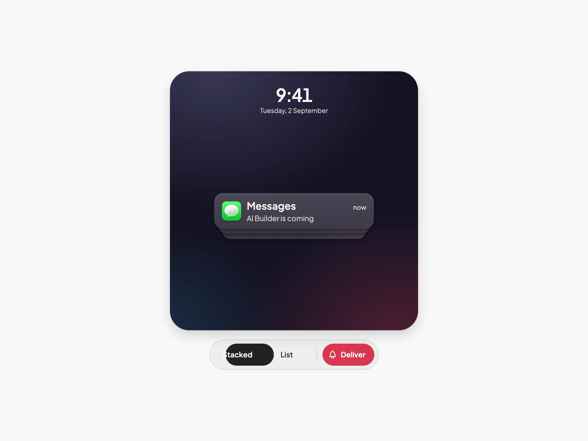
Notification Stack
VanillaReact
An iOS-style lock-screen notification stack where collapsed and expanded are the same DOM and the same transform — tap to unfold, swipe a tile onto Clear, and watch the survivors close the gap.
#notification#lock-screen#stack+3
7276
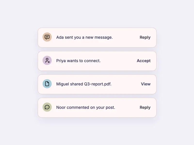
Badge Action Toast
VanillaReact
A stack of notification toasts — each a charcoal card with a coloured circular badge, a message, and an inline action button. Four scenarios (message, friend request, file shared, comment) enter at once, auto-dismiss, and respawn when the stack empties. Token-driven and design-system agnostic.
#toast#notification#badge+3
289
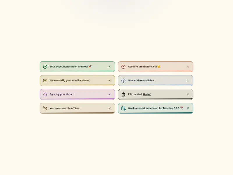
Outlined Toasts
VanillaReact
A grid of eight outlined toast notifications — each a light-tinted card with a 1.5px coloured outline, a 24px line icon, a short message, and a smoothly filling progress bar. One toast spins a loader; one carries an inline link. Fully token-driven and design-system agnostic.
#toast#notification#outlined+2
862727
Bottom Progress Toast
VanillaReact
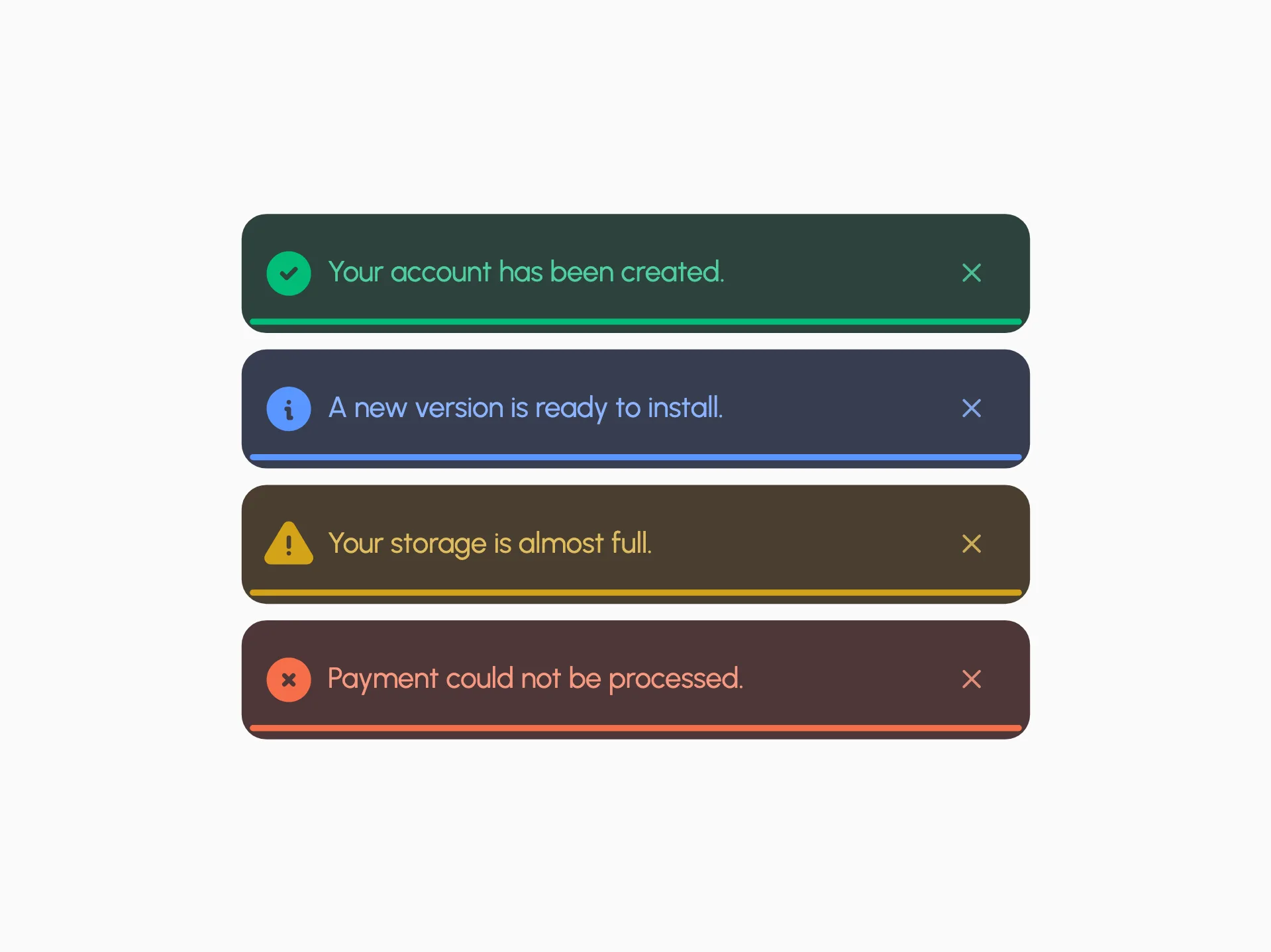
A minimal toast with a thin bottom progress underline in four semantic variants — success, info, warning, and error — each pairing a deep tinted card with a bright pastel accent.
#toast#snackbar#notification+4
14317
Dark Variants
ReactVanilla
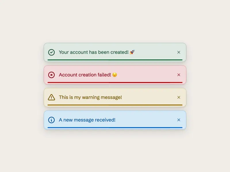
Four filled dark toast cards — success, failure, warning, info — each a semantic dark-tinted slab carrying a bright accent glyph, accent label, and a smoothly filling accent progress bar, rendered from a small data array and fully token-driven and design-system agnostic.
#toast#snackbar#notification+2
3118

Notifications
VanillaReact
A notifications dropdown panel triggered from a header bolt button, with an All/Unread segmented filter, an avatar-driven activity feed, semantic corner badges, green unread markers, inline invite actions, and a dark mode toggle — fully token-driven and design-system agnostic.
#notification#notifications#dropdown+4
6213
Snackbar
ReactVanilla
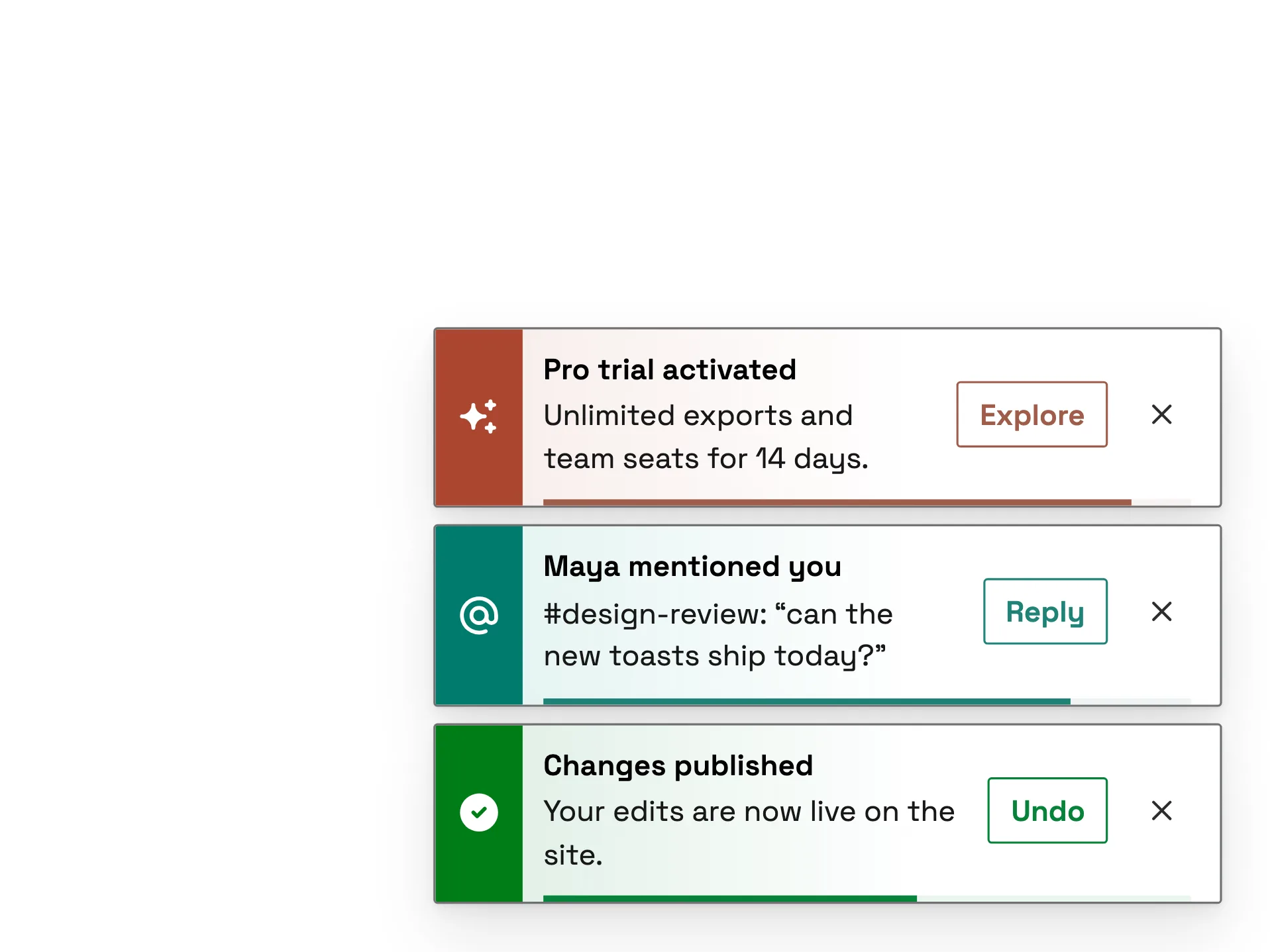
A colour-plate snackbar stack — nine variants (success, info, warning, error, pending, mention, schedule, brand and offline), each led by a solid plate in the system's own state or category colour, read verbatim, bleeding a tinted wash into the bar, with outlined actions and a progress rail.
#colour-plate#dark-mode#notification+3
10205
Soft Badge Toasts
VanillaReact
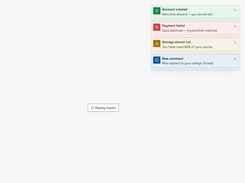
A soft, tinted toast notification stack. Each toast wears a pale tinted fill, a matching border, a square icon badge, a title/message pair, and a countdown progress track. Four variants — success, error, warning, info — auto-dismiss with hover and focus pause, plus a replay trigger.
#toast#notification#badge+2
44891
Toast
VanillaReact
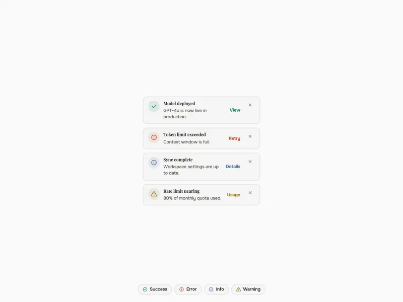
A token-driven toast notification system that renders a staggered set of stacked, auto-dismissing toasts in a fixed corner region across success, error, info, and warning variants — each with a semantic icon chip, inline action, and an auto-dismiss progress indicator that pauses on hover — plus.
#toast#notification#snackbar+2
1251
Alert Triggers
VanillaReact
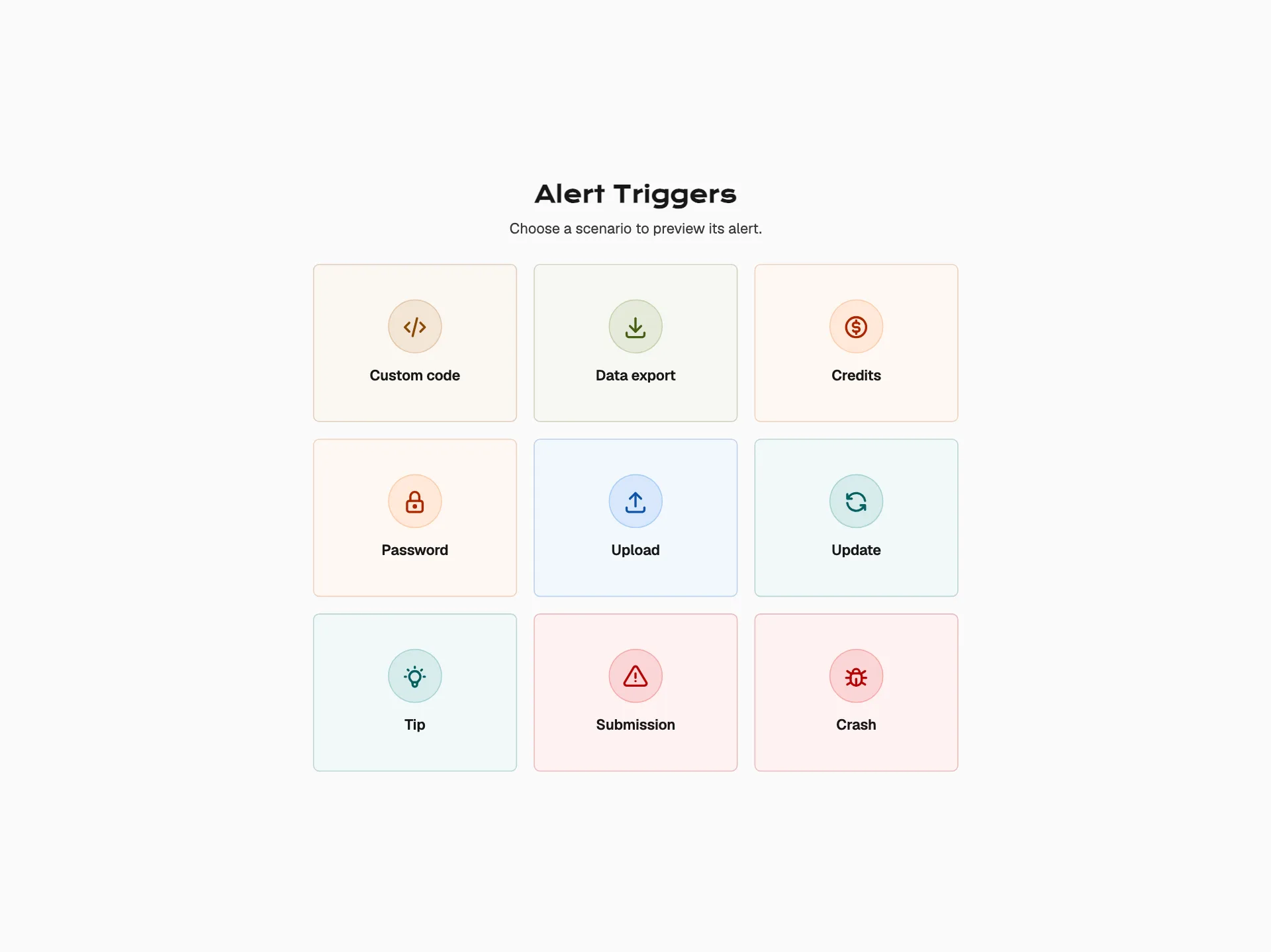
An interactive notification gallery — a grid of nine icon triggers opens block and inline alerts in a focused modal layer with a clear backdrop, predictable dismissal, and restored trigger focus.
#alert#feedback#notification+3
15214
Toast with Action
VanillaReact
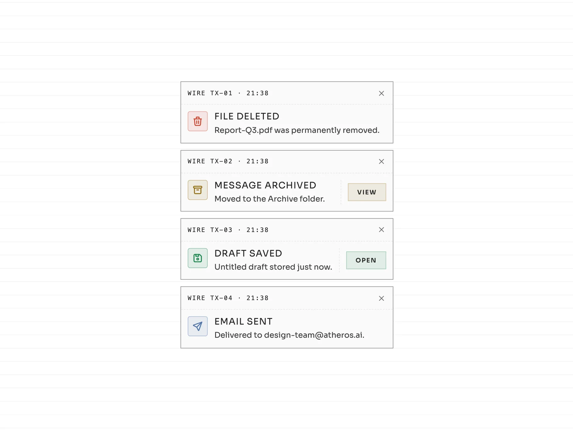
Four telegraph dispatch-slip toasts with mono routing stubs, clear status messages, contextual green View and Open actions, and dismiss controls. Irreversible events do not expose misleading Undo actions.
#toast#notification#undo+4
8251
Skeleton — Staggered
ReactVanilla
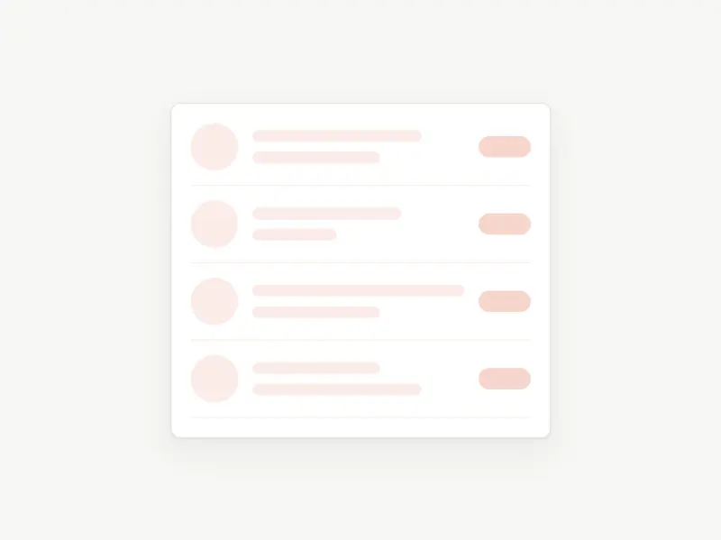
A staggered skeleton loading placeholder — a notification feed whose rows reveal top-to-down in sequence, looping continuously. Token-driven, design-system agnostic, with dark mode and reduced-motion support.
#skeleton#loading#staggered+6
3278
Ready to build faster?
Full access to AI Component Builder: 300+ production-ready components, all top-tier AI models with transparent per-use pricing. Every paid plan includes full Atheros Platform access with courses, tutorials, and challenges.
Starting at $15/month + VAT