Notification Stack
notification#stack
Preview
1280 px
AI Assistant

Grab the code for this component with a free account
Every free component’s full source, ready to copy or download, plus 30 monthly AI credits for Atheros AI routing to make it yours.
Code
Grab the code for this component with free account
Every free component's full source, ready to copy or download, plus 30 monthly AI credits for Atheros AI routing to make it yours.
Notification component
About Notification Stack
An iOS-style lock-screen notification stack where collapsed and expanded are the same DOM and the same transform — tap to unfold, swipe a tile onto Clear, and watch the survivors close the gap.
Features
- Collapsed and expanded are the same transform: every tile position is
--nst-imultiplied by either--nst-row(list) or--nst-peek(stack), so one index rewrite drives unfolding, restacking, delivering and clearing - Painted-glass tiles: each card paints the slab's own wallpaper at its own offset under a dark-ink tint, a hairline rim and an inset highlight — frosted glass with nothing sampled and no
backdrop-filter - Two-stage iOS swipe: a short drag rests the row open on a stationary Clear drawer, a long drag past 55% of the row clears outright, and dragging back closes it
- Tap-to-expand on any tile, tap the empty wallpaper to collapse, and a segmented
Stacked/Listcontrol that drives the same state Deliveradds a notification from a rotating pool onto the front of the stack with a spring entrance and a one-shot bell ring, capped at five tiles- A lock-screen header — a tabular-numeral clock and the date — sits above the stack, decorative (
aria-hidden) and never in the tab order - Five fixed slots keep the frame from reflowing; the live cluster re-centres itself inside the box as tiles arrive and leave
- Buried tiles under a collapsed stack are
inertand drop out of the hit-test, so no focus lands inside the pile and a tap on a peeking sliver reaches the wallpaper and unfolds it - An "All caught up" empty state and a live tile count that rides the cluster down as it unfolds
- Keyboard support: Enter or Space activates a tile, Backspace or Delete clears the focused tile and moves focus to its neighbour, Escape closes an open drawer then collapses the stack
- Respects
prefers-reduced-motion— the intro unfold is skipped, entrances land in place and every transition collapses
Accessibility
- Live region
role="list"witharia-live="polite"on the stack, so arriving and leaving notifications are announced- Notification rows
role="listitem"wrappers around a real<button>whosearia-labelnames the app, the message and the time- Clear action
- A real
<button>with an explicitaria-label, heldinertwhile the drawer is closed - Stack state
- Segmented
<button>pair witharia-pressedkept in sync with the collapsed state - Collapse target
- The empty wallpaper is a decorative
aria-hiddendiv — the accessible path to expand and collapse is the segmented control and Escape - Empty state
- "All caught up" is exposed to assistive tech (only its bell glyph is
aria-hidden) and is toggled withvisibility, so it reaches the accessibility tree exactly while the stack is empty - Buried tiles
- Layers under a collapsed stack are
inertand drop out of the hit-test, so no focus ever lands on a tile hidden inside the pile and overlapping tiles never compete for the same tap; expanding restores them to the tab order - Focus indicators
:focus-visibleoutline in--ringon every control- Touch targets
- Segment buttons and Deliver floored at
--buttons-height-small; tiles are a full row tall - Decorative content
- App icons, the pinwheel, the hint and the empty state are
aria-hidden="true" - Reduced motion
prefers-reduced-motion: reduceskips the intro unfold and collapses every transition
Customise it with AI
Open Notification Stack in Atheros AI Builder, pick a design system and ask the AI assistant to change the layout, copy or behaviour — the notification is regenerated against your tokens. Take the HTML, CSS, JS and React source with you, or pull it into your repo from Claude Code, Cursor or Codex over MCP.
Explore Other Components
View all
Notifications
VanillaReact
A notifications dropdown panel triggered from a header bolt button, with an All/Unread segmented filter, an avatar-driven activity feed, semantic corner badges, accent unread markers, inline invite actions, and a dark mode toggle — fully token-driven and design-system agnostic.
#notification#dropdown
Snackbar
ReactVanilla
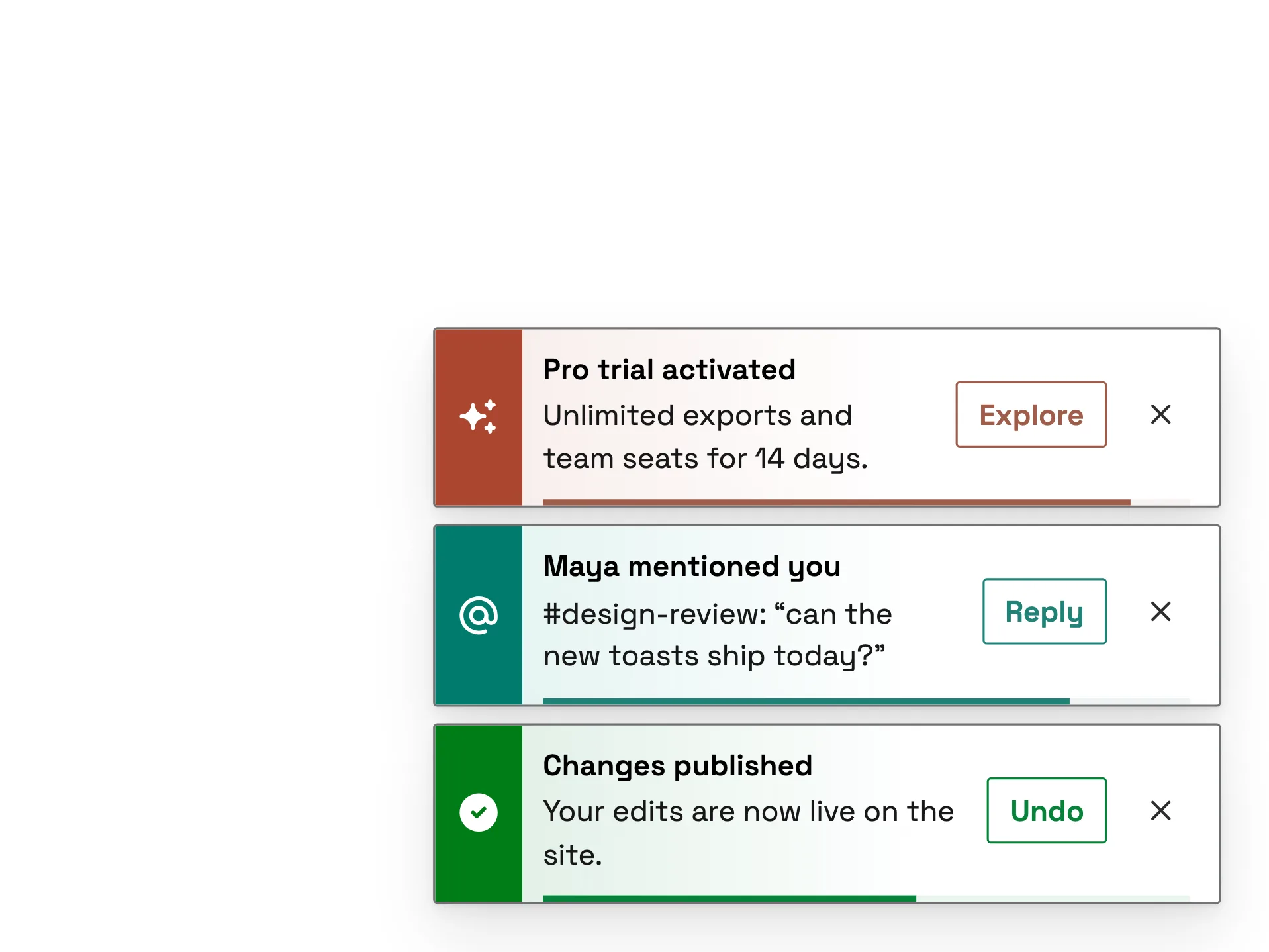
A colour-plate snackbar stack — nine variants (success, info, warning, error, pending, mention, schedule, brand and offline), each led by a solid plate in the system's own state or category colour, read verbatim, bleeding a tinted wash into the bar, with outlined actions and a progress rail.
#notification#snackbar#toast
Skeleton — Staggered
ReactVanilla
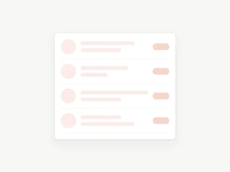
A staggered skeleton loading placeholder — a notification feed whose rows reveal top-to-down in sequence, looping continuously. Token-driven, design-system agnostic, with dark mode and reduced-motion support.
#skeleton#loading#notification
Vinyl Vault
VanillaReact
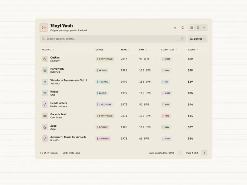
A record-collection data table with search, sorting, multiple views, CSV export, and asynchronous loading.
#table#search
Outlined Toasts
VanillaReact
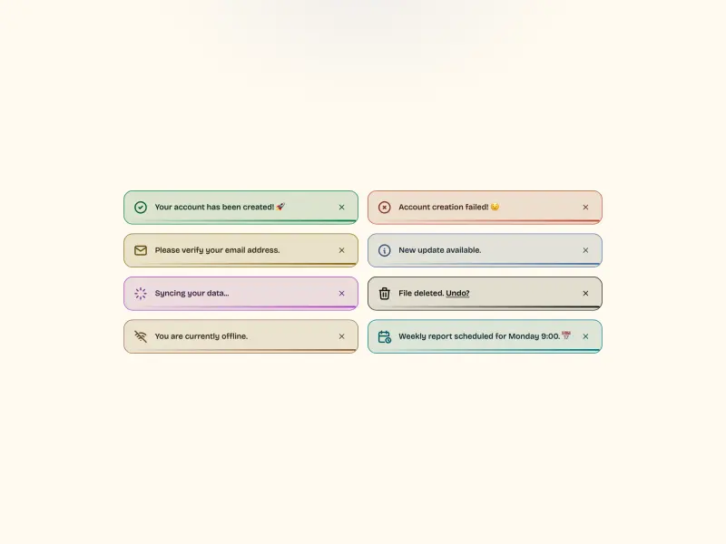
A grid of eight outlined toast notifications — each a light-tinted card with a 1.5px coloured outline, a 24px line icon, a short message, and a smoothly filling progress bar. One toast spins a loader; one carries an inline link. Fully token-driven and design-system agnostic.
#toast#notification
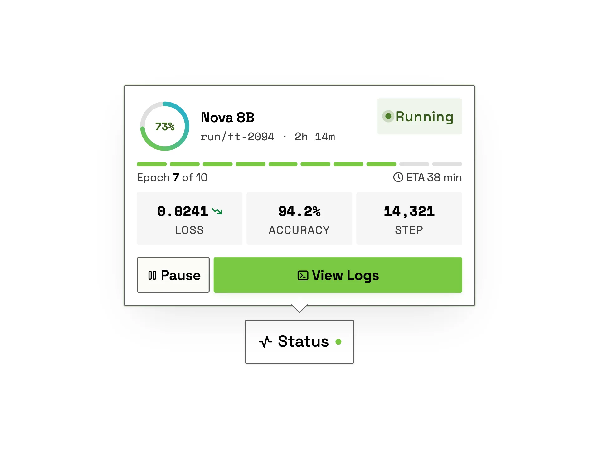
Training Status Popover
VanillaReact
A premium model training-status popover: a gradient progress ring with live percentage count-up, a running status badge with pulsing dot, an epoch segment strip with ETA, live loss/accuracy/step metric tiles and pause / view-logs actions, revealed from a trigger with staggered entrance.
#popover#progress#ai
Ready to build?
300+ production-ready components and Atheros AI models. Every paid plan includes access to the whole Atheros — AI Builder and Learning.
Starting at $9.9 per month, billed annually