Notifications
AI Pass+notification#dropdown
design.md
Preview
1280 px
AI Assistant

Grab the code for this component with a free account
Every free component’s full source, ready to copy or download, plus 30 monthly AI credits for Atheros AI routing to make it yours.
Code
Grab the code for this component with free account
Every free component's full source, ready to copy or download, plus 30 monthly AI credits for Atheros AI routing to make it yours.
Notification component
About Notifications
A notifications dropdown panel triggered from a header bolt button, with an All/Unread segmented filter, an avatar-driven activity feed, semantic corner badges, accent unread markers, inline invite actions, and a dark mode toggle — fully token-driven and design-system agnostic.
Features
- Header bell button with an unread count and
aria-expandedstate - Floating dropdown panel with scale + fade open/close animation
- All / Unread segmented filter control
- Keyboard arrow/Home/End navigation between filters keeps selection and focus synchronized
- Avatar activity feed with real WebP portraits over accent discs; the colored initial disc (violet, amber, green, rose, blue, orange) shows through as an automatic fallback if a photo fails to load, and stays as-is for non-person generation events
- Semantic corner badges per event type: comment (message), generated (sparkles), invite (user-plus), like (heart) — official Tabler glyphs
- Bold action lines with emphasized target names and clamped comment bodies
- Generated-result metadata lines (style + prompt)
- Inline invite actions: Decline (light) and Accept (near-black)
- Green unread dots; click a row to mark it read; trigger dot clears when none remain
- Staggered entrance animation on open (transform + opacity only)
- Light and dark roles are supplied by the host browser
- Keyboard accessible: Escape to close, focus-visible rings, reduced-motion support
- Responsive: full-width panel on mobile (< 480px)
Accessibility
- Trigger button
aria-haspopup="true",aria-expandedtoggled,aria-label- Panel
role="region"witharia-label="Notifications"- Filter control
role="tablist"withrole="tab"+aria-selectedbuttons, eacharia-labelled- Unread dot
role="img"witharia-label="Unread"- Invite actions
- Each button carries a descriptive
aria-label - Live region
- Visually-hidden
role="status"aria-live="polite"region announces invite outcomes and read-state changes - Empty state
role="status"on the "all caught up" message- Focus indicators
:focus-visiblewith--ringoutline on all interactive elements- Reduced motion
prefers-reduced-motion: reducedisables animations- Escape key
- Closes panel and returns focus to trigger
Customise it with AI
Open Notifications in Atheros AI Builder, pick a design system and ask the AI assistant to change the layout, copy or behaviour — the notification is regenerated against your tokens. Take the HTML, CSS, JS and React source with you, or pull it into your repo from Claude Code, Cursor or Codex over MCP.
Explore Other Components
View all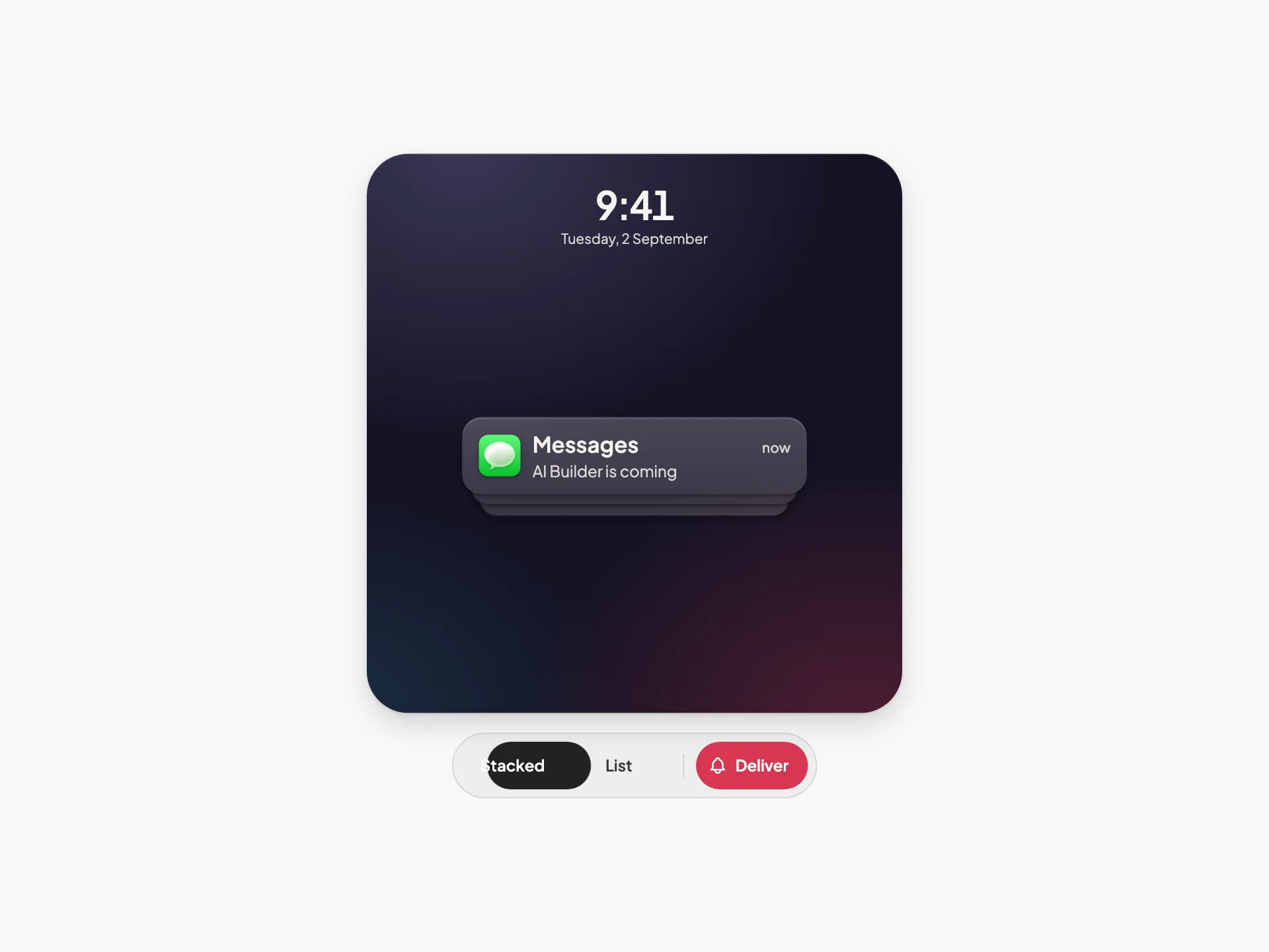
Notification Stack
VanillaReact
An iOS-style lock-screen notification stack where collapsed and expanded are the same DOM and the same transform — tap to unfold, swipe a tile onto Clear, and watch the survivors close the gap.
#notification#stack
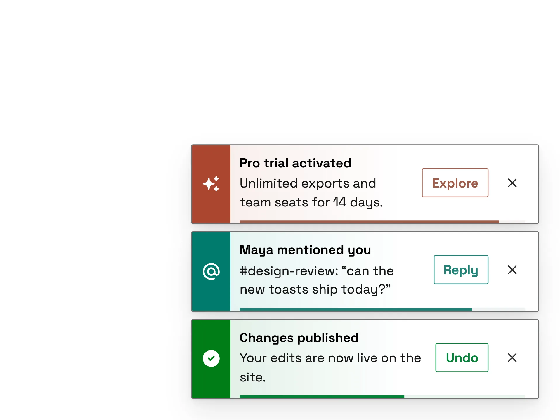
Snackbar
ReactVanilla
A colour-plate snackbar stack — nine variants (success, info, warning, error, pending, mention, schedule, brand and offline), each led by a solid plate in the system's own state or category colour, read verbatim, bleeding a tinted wash into the bar, with outlined actions and a progress rail.
#notification#snackbar#toast
Profile Dropdown Menu
ReactVanilla
A profile dropdown led by an identity header for the signed-in account, with quick actions and soft key-chip shortcut hints, a What's new discovery item, a switch-account list of the other accounts with a hover switch arrow, a dark mode toggle row grouped above the error-weighted sign-out action — fully token-driven and design-system agnostic.
#account-switcher#dark-mode#responsive
Skeleton — Outline
VanillaReact
An outline skeleton loading placeholder — wireframe shapes fill in one after another across an article card while content loads. Token-driven, design-system agnostic, with dark mode and reduced-motion support.
#skeleton#loading#outline
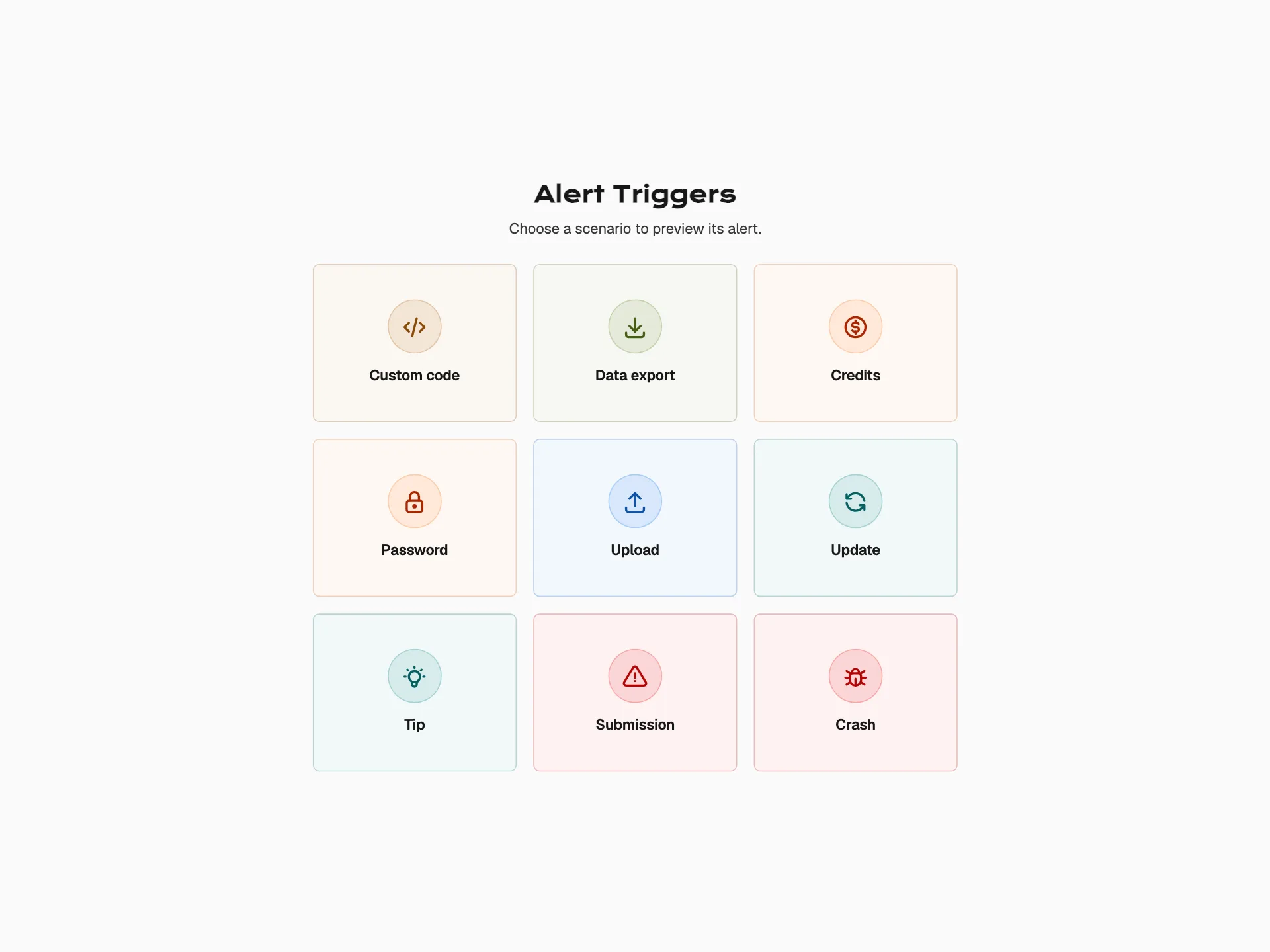
Alert Triggers
VanillaReact
An interactive notification gallery — a grid of nine icon triggers opens block and inline alerts in a focused modal layer with a clear backdrop, predictable dismissal, and restored trigger focus.
#alert#feedback#notification
Modal — Bottom Sheet
VanillaReact
An accessible mobile-app bottom sheet that springs up from the bottom edge with a grab handle, an amount summary, and list-rows instead of a paragraph — a fintech payment-confirmation sheet themed by the Neovault design system (inspired by Revolut), with a full-width pill CTA and full keyboard.
#modal#dialog#animation
Ready to build?
300+ production-ready components and Atheros AI models. Every paid plan includes access to the whole Atheros — AI Builder and Learning.
Starting at $9.9 per month, billed annually