Snackbar
AI Pass+notification#snackbar#toast
design.md
Preview
1280 px
AI Assistant

Grab the code for this component with a free account
Every free component’s full source, ready to copy or download, plus 30 monthly AI credits for Atheros AI routing to make it yours.
Code
Grab the code for this component with free account
Every free component's full source, ready to copy or download, plus 30 monthly AI credits for Atheros AI routing to make it yours.
Notification component
About Snackbar
A colour-plate snackbar stack — nine variants (success, info, warning, error, pending, mention, schedule, brand and offline), each led by a solid plate in the system's own state or category colour, read verbatim, bleeding a tinted wash into the bar, with outlined actions and a progress rail.
Features
- Programmatic
showSnackbar({ variant, title, message, actionLabel, duration })API — nine variants: the four semantic states (success, info, warning, error), the in-flightpendingstate, two differentiated-group notices (mention,schedule) and two solid bars (brand,offline), each with its own Tabler glyph - Every variant carries a colour TRIO, never one token: the authored FILL for the plate and wash (the state or category token verbatim, in both themes — no mix, no re-derivation), a gated ON ink for the glyph on that fill, and a readable INK for the action label, outline and progress rail on the surface
- Colour plate — a full-height column on the bar's left in the variant's authored hue with the glyph in the shell's contrast-gated on-fill companion; it rides both left corners of the frame and is clipped concentric by it
- Tinted wash — the plate's colour bleeds into the bar as a translucent gradient over the surface; the bar keeps only its neutral elevation, no colour glow
- Solid bars —
brandpaints the whole bar in the selection fill with the accent ink,offlineinverts the surface into the text colour; every line of copy, the close button, the outlined action and the rail take the gated on-fill ink - Every action button carries its own opaque ground (the surface, or the solid bar's fill), so a contrast walker that composites ancestor backgrounds resolves the ground the eye sees rather than the wash gradient's first stop
- Auto-dismiss timer with a per-variant duration and a progress rail that starts and ends on the same vertical lines as the copy, driven frame-by-frame via
requestAnimationFrameand--snk-pscaleX - Focusing a snackbar pauses its timer and progress rail; leaving resumes from where it stopped
- Self-running tour — on load the demo seeds success, mention and brand, and a rotating single variant respawns whenever the stack empties
- Stack capped at four visible snackbars — the oldest is dismissed when the cap is exceeded
- Two-layer entrance — the wrapper slides up with a fade (rises from the bottom on mobile) while the body springs in with a soft scale
- FLIP restack — survivors glide into place after a dismissal and existing snackbars shift up smoothly when a new one arrives
- Escape dismisses the newest snackbar; every dismissal plays a quiet slide-fade exit
Accessibility
- Live region
aria-live="polite"role="status"aria-atomic="true"on the snackbar stack- Dismiss button
- Real
<button>witharia-label="Dismiss snackbar"and visible focus ring - Action button
- Real
<button>carrying its label asaria-label, outlined in the variant's readable ink - Contrast
- Title, message, action and close inks meet 4.5:1 and the rail 3:1 on every published system in both themes; state plate glyphs meet 3:1 everywhere, category plate glyphs on all but the systems whose raw category base is lighter than its readable tier
- Timer pause
- Focus pauses auto-dismiss so content stays readable
- Focus indicators
:focus-visiblewith--ringoutline; solid bars switch the outline to their on-fill ink- Reduced motion
prefers-reduced-motion: reducedisables all animations- Viewport
100dvhfor mobile-safe viewport height
Customise it with AI
Open Snackbar in Atheros AI Builder, pick a design system and ask the AI assistant to change the layout, copy or behaviour — the notification is regenerated against your tokens. Take the HTML, CSS, JS and React source with you, or pull it into your repo from Claude Code, Cursor or Codex over MCP.
Explore Other Components
View all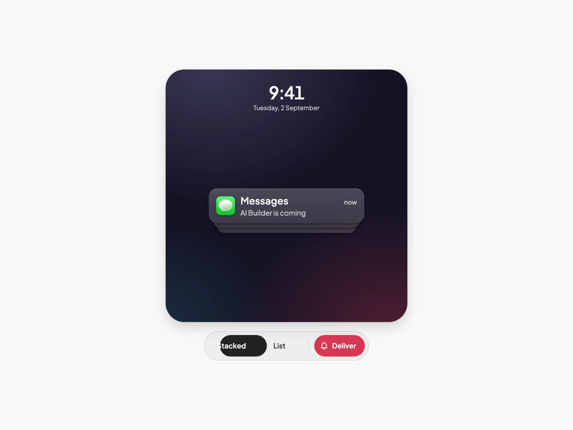
Notification Stack
VanillaReact
An iOS-style lock-screen notification stack where collapsed and expanded are the same DOM and the same transform — tap to unfold, swipe a tile onto Clear, and watch the survivors close the gap.
#notification#stack

Notifications
VanillaReact
A notifications dropdown panel triggered from a header bolt button, with an All/Unread segmented filter, an avatar-driven activity feed, semantic corner badges, accent unread markers, inline invite actions, and a dark mode toggle — fully token-driven and design-system agnostic.
#notification#dropdown
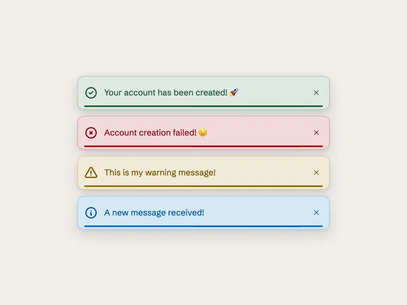
Dark Variants
ReactVanilla
Four filled dark toast cards — success, failure, warning, info — each a semantic dark-tinted slab carrying a bright accent glyph, accent label, and a smoothly filling accent progress bar, rendered from a small data array and fully token-driven and design-system agnostic.
#toast#snackbar#notification
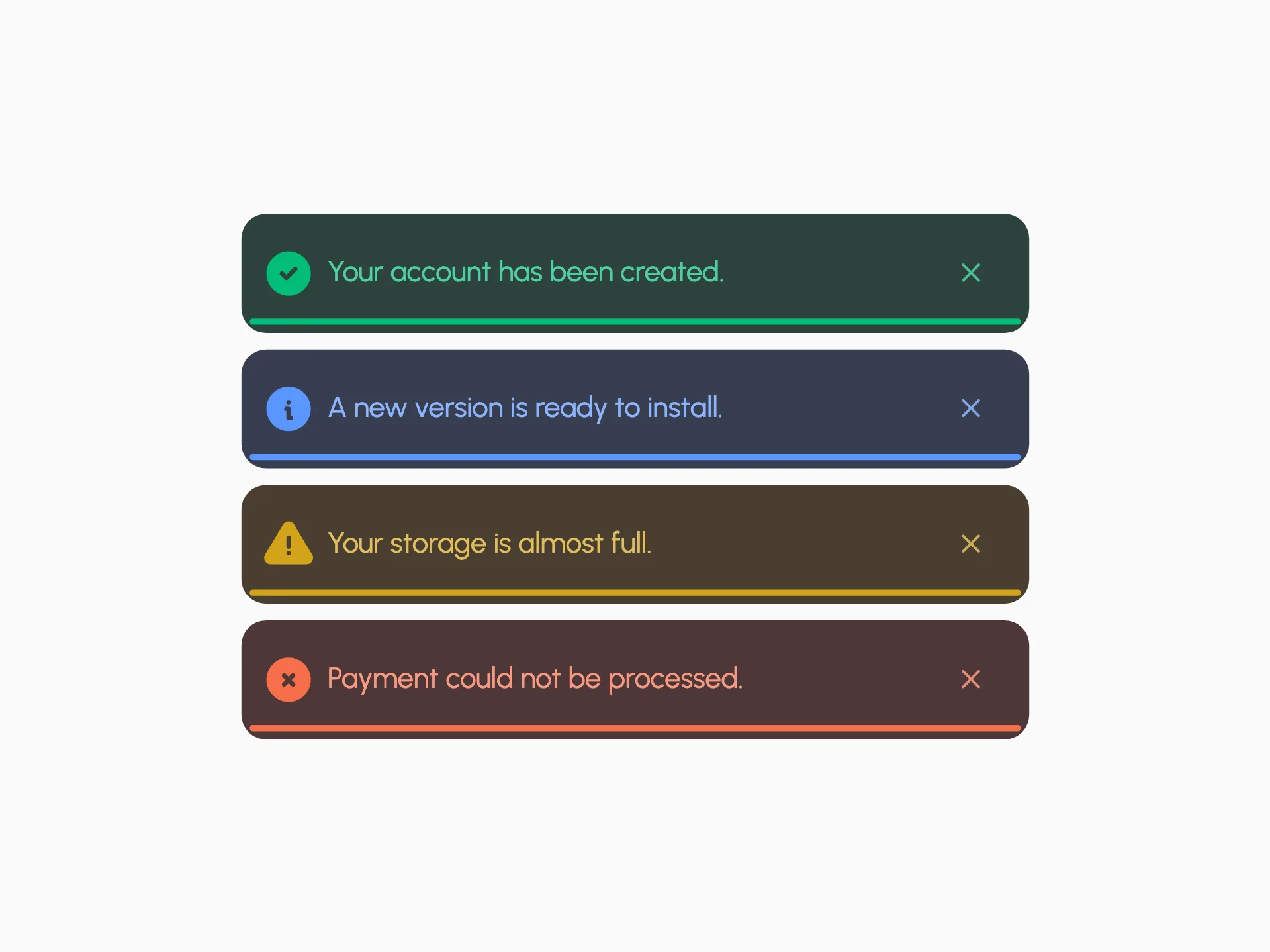
Bottom Progress Toast
VanillaReact
A minimal toast with a thin bottom progress underline in four semantic variants — success, info, warning, and error — each pairing a deep tinted card with a bright accent.
#toast#snackbar#notification
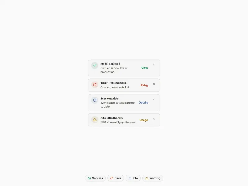
Toast
VanillaReact
A token-driven toast notification system that renders a staggered set of stacked, auto-dismissing toasts in a fixed corner region across success, error, info, and warning variants — each with a semantic icon chip, inline action, and an auto-dismiss progress indicator that pauses on hover — plus.
#toast#notification#snackbar
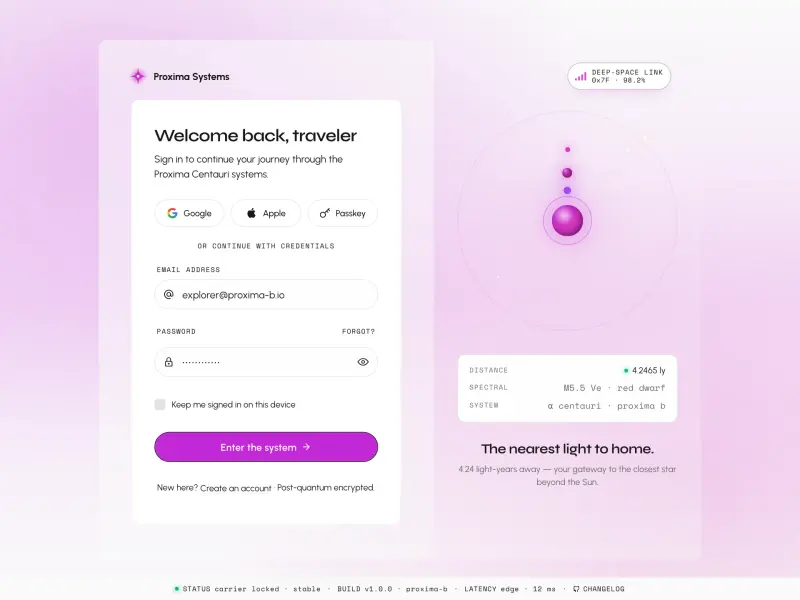
Login — Proxima
VanillaReact
A cosmic split-screen login with Proxima Centauri orbital visualization, social sign-in (Google, Apple, Passkey), real-time email and password validation, animated star-field background, and a full HUD status bar — fully token-driven and design-system agnostic.
#login#form#validation
Ready to build?
300+ production-ready components and Atheros AI models. Every paid plan includes access to the whole Atheros — AI Builder and Learning.
Starting at $9.9 per month, billed annually