Template Gallery
/
Showing 12 of 17 matching templates

Bento Grid
VanillaReact
A responsive bento grid layout with asymmetric skeleton cells, dark/light theme toggle, and full design-system token integration — mobile-first and design-system agnostic.
#layout#bento#grid+4
1212120

Asymmetric Quad
VanillaReact
An asymmetric quad layout — four differently sized panels: an oversized hero, a nested stat/goals/spark trio, an avatar feed with captioned media, and a checkbox task panel. Skeleton wireframes driven by design tokens, reflowing from a 2×2 grid to a single column, mobile-first.
#layout#asymmetric#quad+5
1282290
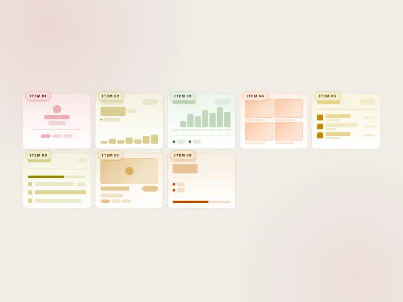
Auto-Fit Grid
VanillaReact
A responsive auto-fit grid layout — eight equal skeleton tiles that reflow with `repeat(auto-fit, minmax())`, dark/light theme toggle, and full design-system token integration, mobile-first and design-system agnostic.
#layout#auto-fit#grid+4
278

Blog Article
VanillaReact
A responsive blog article layout with navigation, hero image, article body, sidebar with TOC/tags/related posts, related articles grid, and footer — skeleton wireframe, design-system agnostic.
#layout#blog#article+5
10246

Card Grid
VanillaReact
A responsive card-grid bento — thirteen skeleton cards, each a distinct anatomy (KPI, stat, usage, banner, team, article, media hero, profile, product, tasks) placed with named `grid-template-areas` that reflow across four breakpoints, mobile-first and design-system agnostic.
#layout#card-grid#bento+4
14327

Grid Dashboard
ReactVanilla
A responsive grid dashboard layout — six wireframe regions (header app bar, sidebar nav with pinned profile, KPI + multi-bar chart main, goal-progress widget, statistics table, status-bar footer) on a named-area CSS grid, mobile-first and design-system agnostic.
#layout#dashboard#grid+5
46861
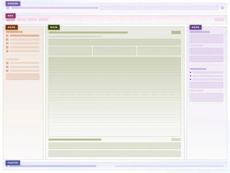
Holy Grail Layout
VanillaReact
A CSS grid holy grail layout with six skeleton wireframe regions (header, nav, aside-left, main, aside-right, footer), colored dashed borders, container queries for fluid sidebars, and full design-system token integration.
#layout#holy-grail#grid+5
45416

Kaleidoscope Layout
VanillaReact
A responsive skeleton wireframe layout that morphs through five distinct CSS grid arrangements as the viewport resizes, with eight named regions, per-region accent hues, and dark/light theme toggle.
#layout#grid#skeleton+5
41920

Magazine
ReactVanilla
An editorial magazine wireframe — masthead header, section nav, dual article rails, a featured lead story with popular posts, a most-read list with pull-quote, and footer. Skeleton-only, mobile-first, design-system agnostic.
#layout#magazine#editorial+4
32687
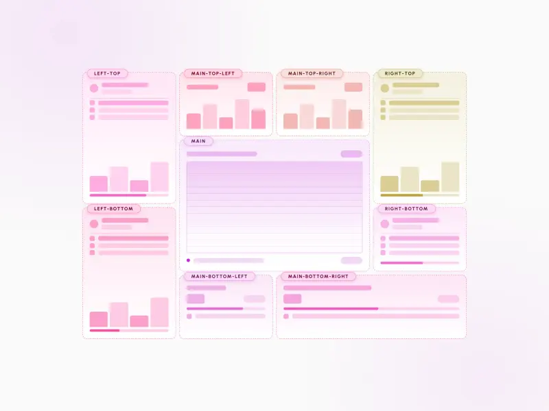
Nine-Cell Bento
VanillaReact
A nine-cell bento layout with corner-and-center emphasis — four small corner accents and four paired content cells flanking a large 2×2 central hero, plus skeleton placeholders, CSS-only dark mode, and full design-system token integration.
#layout#bento#grid+5
23858

Split Bento
VanillaReact
A split bento layout — two columns, each a self-contained asymmetric sub-grid with one wide tile and two half-width tiles, plus skeleton placeholders, a dark/light theme toggle, and full design-system token integration.
#layout#bento#grid+5
12347

Tri-Sidebar
VanillaReact
A tri-sidebar app-frame layout — a full-width header and footer wrap a left nav rail, a central main surface, a status strip, and a right widgets aside. Regions reflow from a single mobile column to the full three-column frame, mobile-first and design-system agnostic.
#layout#tri-sidebar#app-frame+4
3126
Ready to build faster?
Full access to AI Component Builder: 300+ production-ready components, all top-tier AI models with transparent per-use pricing. Every paid plan includes full Atheros Platform access with courses, tutorials, and challenges.
Starting at $15/month + VAT