Bento Skyline
AI Pass+layout#bento#grid#responsive#skeleton
Preview
1280 px
AI Assistant

Grab the code for this component with a free account
Every free component’s full source, ready to copy or download, plus 30 monthly AI credits for Atheros AI routing to make it yours.
Code
Grab the code for this component with free account
Every free component's full source, ready to copy or download, plus 30 monthly AI credits for Atheros AI routing to make it yours.
Layout component
About Bento Skyline
An eight-cell bento — hero, skyline chart, image, two stats, list, quote and CTA — that rebuilds its grid-template-areas at 480, 768, 1024 and 1280px, keeps its own eight-hue region palette in light and dark, and switches between skeleton placeholders and real content from a fixed toolbar.
Features
- Eight named cells (hero, chart, stat-a, stat-b, image, list, quote, cta), each carrying its own authored region hue — amber, rose, cyan, lime, violet, green, blue, magenta
- Five responsive layouts driven by viewport media queries: a single column, a two-column bento at 480px, a four-column grid with a 2×2 hero at 768px, a six-column skyline at 1024px and a twelve-column ultra-wide at 1280px with a tall stat A
- Skeleton placeholders sized in
emoff one root unit so every bar, ring and chart column scales with the viewport without reflow jumps - Skyline chart whose twelve columns keep fixed percentage heights; the last four columns and a fourth list row only appear at 1280px with a rise-in animation
- Hero brand row with the Atheros AI Builder mark and gradient wordmark; the wordmark hides with hysteresis when it cannot fit beside the mark and never renders clipped
- Product URL that scales with the hero's container width via
cqwunits - Skeleton / content switch in a fixed top-right toolbar: a
role="switch"button cross-fades every cell between placeholders and real copy, chart, stats, list, quote and CTA without changing any cell size - Real content mode: headline and copy, a labelled bar chart with a peak callout, a gradient illustration with caption, stat values with a trend pill and a 68% ring, a feature list, an attributed quote and a CTA button
- CSS-only dark mode (
body.dark) with lifted region-hue twins, no built-in theme toggle - Prefers-reduced-motion support for the cross-fade and the rise-in animation
Accessibility
- Landmark
- The bento is a
<section aria-label="Bento skyline layout">inside<main>; the switch lives in a separate fixed toolbar outside<main> - Headings
- Each cell is a
<section>whose region tag is an<h2 class="bsk-tag">; the hero headline is an<h3> - Switch
<button id="bsk-skeleton-toggle" role="switch" aria-checked>with a visible "Skeleton" label,aria-label, keyboard activation and a:focus-visiblering- Layers
- The inactive layer carries
aria-hidden="true"andvisibility: hidden, so only the visible mode reaches assistive technology - Decorative skeleton
- Every skeleton shape is inside an
aria-hiddenlayer; the live chart and ring carryrole="img"with a full text alternative - Brand mark
- Mounted from a
data-srcslot withalt="Atheros AI Builder" - Busy state
- The bento starts
aria-busy="true"and is cleared tofalsebymarkReady()on load - Reduced motion
prefers-reduced-motion: reducecollapses the cross-fade, the rise-in and every transition- Dynamic viewport
- Uses
100dvhfor proper mobile viewport height
Customise it with AI
Open Bento Skyline in Atheros AI Builder, pick a design system and ask the AI assistant to change the layout, copy or behaviour — the layout is regenerated against your tokens. Take the HTML, CSS, JS and React source with you, or pull it into your repo from Claude Code, Cursor or Codex over MCP.
Explore Other Components
View all
Split Bento
VanillaReact
A split bento layout — two columns, each a self-contained asymmetric sub-grid with one wide tile and two half-width tiles, plus skeleton placeholders, a dark/light theme toggle, and full design-system token integration.
#layout#bento#grid

Magazine
VanillaReact
An editorial magazine wireframe — masthead header, section nav, dual article rails, a featured lead story with popular posts, a most-read list with pull-quote, and footer. Skeleton-only, mobile-first, design-system agnostic.
#layout#editorial#grid
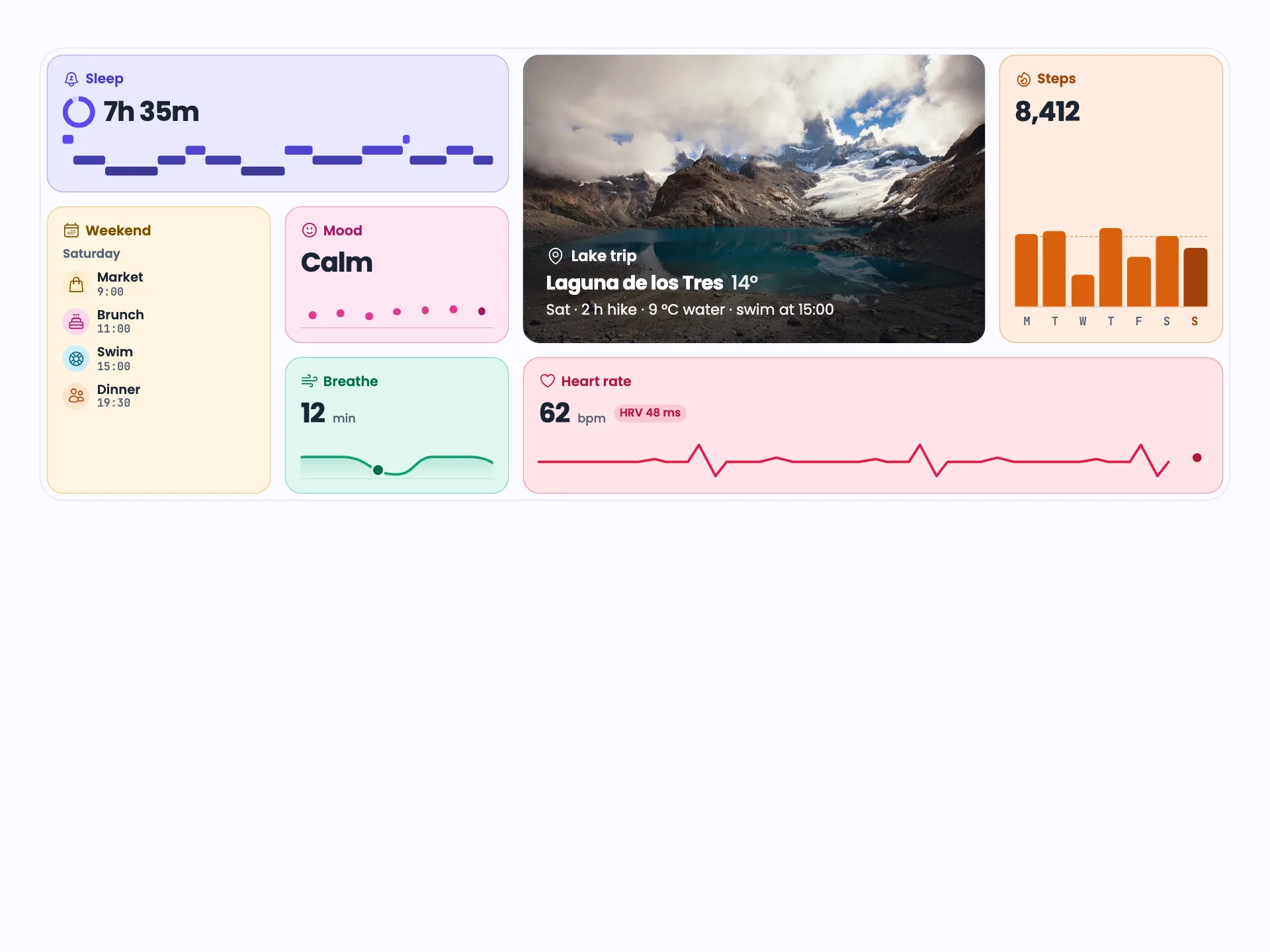
Expanding Bento
VanillaReact
A seven-tile lifestyle bento on grid-template-areas: tap a tile and it takes the 2×2 hero slot while the others reflow, animated with View Transitions. Five container-query tiers from one to five columns, flat tinted tiles, light and dark.
#layout#bento#grid
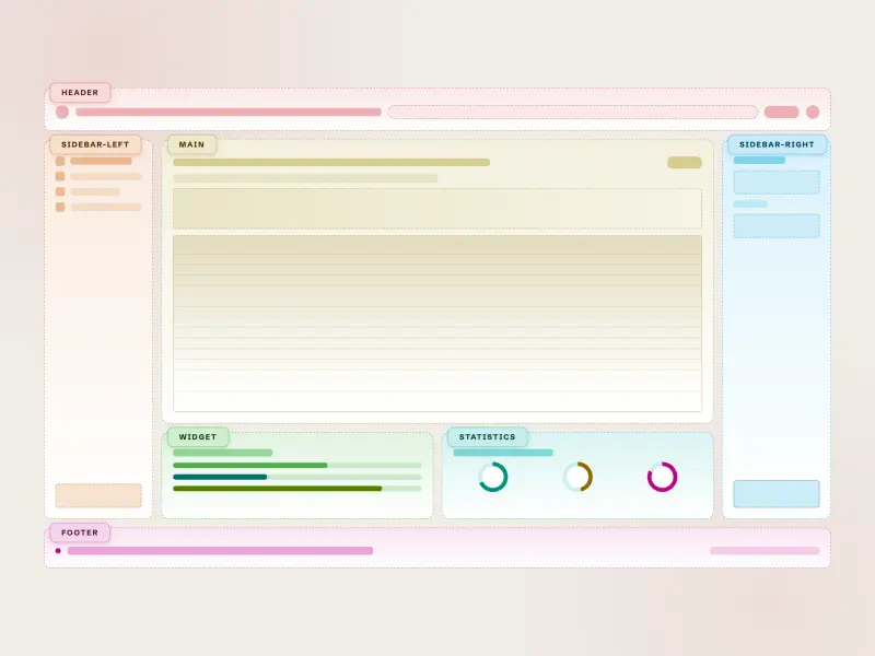
Dual Sidebar Widgets
ReactVanilla
A responsive dual-sidebar layout wireframe with header, twin sidebars, main content area, widget and statistics panels, and footer — skeleton placeholders, CSS-only dark mode (`body.dark`), and full design-system token integration.
#layout#sidebar#grid

Asymmetric Quad
ReactVanilla
An asymmetric quad layout — four differently sized panels: an oversized hero, a nested stat/goals/spark trio, an avatar feed with captioned media, and a checkbox task panel. Skeleton wireframes driven by design tokens, reflowing from a 2×2 grid to a single column, mobile-first.
#layout#grid#bento
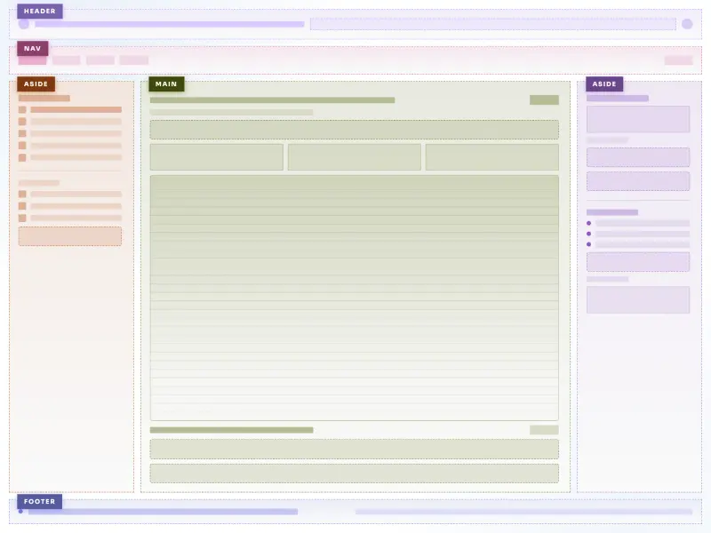
Holy Grail Layout
VanillaReact
A CSS grid holy grail layout with six skeleton wireframe regions (header, nav, aside-left, main, aside-right, footer), colored dashed borders, container queries for fluid sidebars, and full design-system token integration.
#layout#grid#skeleton
Ready to build?
300+ production-ready components and Atheros AI models. Every paid plan includes access to the whole Atheros — AI Builder and Learning.
Starting at $9.9 per month, billed annually