Auto-Fit Grid
AI Pass+layout#grid#skeleton
design.md
Preview
1280 px
AI Assistant

Grab the code for this component with a free account
Every free component’s full source, ready to copy or download, plus 30 monthly AI credits for Atheros AI routing to make it yours.
Code
Grab the code for this component with free account
Every free component's full source, ready to copy or download, plus 30 monthly AI credits for Atheros AI routing to make it yours.
Layout component
About Auto-Fit Grid
A responsive auto-fit grid layout — eight equal skeleton tiles that reflow with `repeat(auto-fit, minmax())`, dark/light theme toggle, and full design-system token integration, mobile-first and design-system agnostic.
Features
- Auto-fit column reflow via
repeat(auto-fit, minmax())— tiles rewrap to fill the row as the viewport changes - Eight equal tiles, each a distinct card role (profile, stat, chart, gallery, feed, tasks, promo, metrics)
- Skeleton wireframe placeholders with color-mixed accents derived from design tokens
- Responsive minmax floor steps up at 480px and 768px so tiles never collapse to a sliver
- Dark/light theme toggle with smooth CSS transitions
- All colors, spacing, and radii driven by design-system tokens
- Prefers-reduced-motion support for accessibility
- Per-tile accent colors computed via oklch color-mix from semantic palette tokens
Accessibility
- ARIA label
.bentogrid hasaria-label="Auto-fit grid layout"- Busy state
.bentostartsaria-busy="true"and is cleared tofalsebymarkReady()once rendered- Reduced motion
prefers-reduced-motion: reducekills all animations and transitions- Focus-visible
- Interactive focus styling relies on
:focus-visiblefrom the design tokens - Dynamic viewport
- Uses
100dvhfor proper mobile viewport height
Customise it with AI
Open Auto-Fit Grid in Atheros AI Builder, pick a design system and ask the AI assistant to change the layout, copy or behaviour — the layout is regenerated against your tokens. Take the HTML, CSS, JS and React source with you, or pull it into your repo from Claude Code, Cursor or Codex over MCP.
Explore Other Components
View all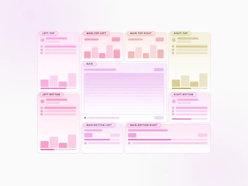
Nine-Cell Bento
ReactVanilla
A nine-cell bento layout with corner-and-center emphasis — four small corner accents and four paired content cells flanking a large 2×2 central hero, plus skeleton placeholders, CSS-only dark mode, and full design-system token integration.
#layout#bento#grid

Tri-Sidebar
ReactVanilla
A tri-sidebar app-frame layout — a full-width header and footer wrap a left nav rail, a central main surface, a status strip, and a right widgets aside. Regions reflow from a single mobile column to the full three-column frame, mobile-first and design-system agnostic.
#layout#grid#skeleton
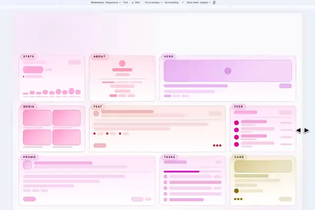
Bento Grid
ReactVanilla
A responsive bento grid layout with asymmetric skeleton cells, dark/light theme toggle, and full design-system token integration — mobile-first and design-system agnostic.
#layout#bento#grid

Dual Sidebar Widgets
ReactVanilla
A responsive dual-sidebar layout wireframe with header, twin sidebars, main content area, widget and statistics panels, and footer — skeleton placeholders, CSS-only dark mode (`body.dark`), and full design-system token integration.
#layout#sidebar#grid

Kaleidoscope Layout
ReactVanilla
A responsive skeleton wireframe layout that morphs through five distinct CSS grid arrangements as the viewport resizes, with eight named regions, per-region accent hues, and dark/light theme toggle.
#layout#grid#skeleton

Magazine
VanillaReact
An editorial magazine wireframe — masthead header, section nav, dual article rails, a featured lead story with popular posts, a most-read list with pull-quote, and footer. Skeleton-only, mobile-first, design-system agnostic.
#magazine#responsive#design-tokens
Ready to build?
300+ production-ready components and Atheros AI models. Every paid plan includes access to the whole Atheros — AI Builder and Learning.
Starting at $9.9 per month, billed annually