Template Gallery
/
Showing 12 of 15 matching templates
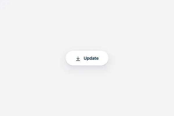
Animated Update Progress Button
React
An interactive update button with smooth transitions, animated progress feedback, and a cancel action. Features a sleek pill-shaped design with subtle blue gradients and fluid motion.
#button#animation#design-system
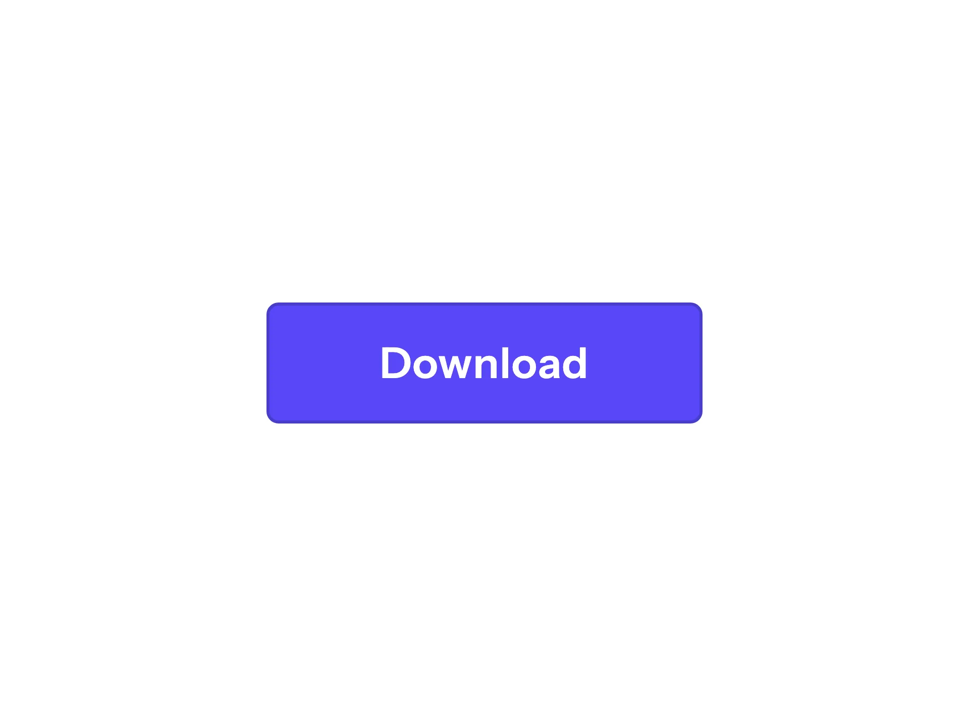
Icon Swap Button
VanillaReact
A gradient pill button where the text label slides up and a download icon slides in from below on hover — driven entirely by GPU-composited `translateY` transitions with no layout recalculation.
#button#gradient#pill
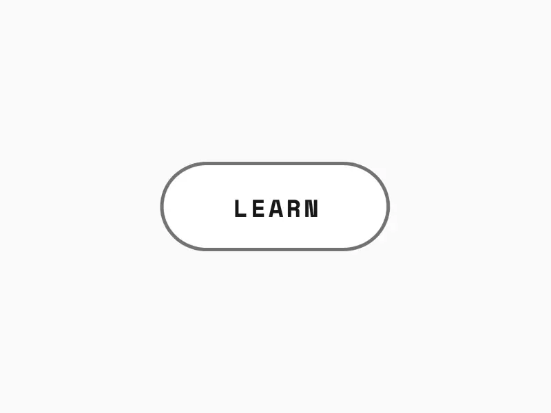
Border Draw Button
VanillaReact
A minimal uppercase text button whose accent outline grows from zero at the top-left corner on hover, changing from a muted idle border to an accent border at a consistent weight.
#button#border#outline

Circle Expand Button
VanillaReact
A gradient accent circle with a contrasting chevron arrow that expands into a full pill on hover, sweeping under the label — a faithful port of the original circle-expand button, animated with GPU-friendly `clip-path` + `transform: scaleX()` instead of a width transition.
#button#gradient#transform
Expand Button
VanillaReact
Circle icon button that morphs into a gradient pill on hover — the icon flies up as the label scales in, via a GPU-composited clip-path reveal.
#button#pill#gradient
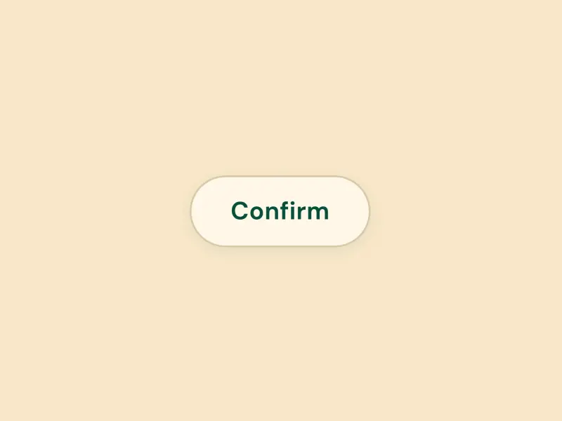
Flip Button
VanillaReact
A 3D card-flip button that rotates on hover to reveal a confirmation state using CSS perspective and `rotateY(180deg)` transform — fully design-system agnostic.
#button#3d#transform

Gradient Sweep Button
VanillaReact
A pill-shaped button whose fill wipes in from the left edge: an overlay layer scales from scaleX(0) to scaleX(1) on hover and on keyboard focus, while the trailing icon chip inverts to the accent colour.
#button#transform
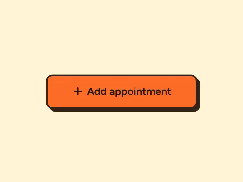
Ink Press Button
VanillaReact
A press button with a sharp-cornered accent fill, a 2px border, and a hard offset shadow that collapses as the button physically presses down into the page on click — powered by GPU-composited `transform: translate()` transitions.
#button#transform
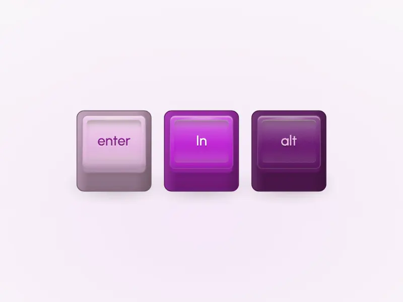
Keycap Buttons
VanillaReact
Three vintage mechanical-keyboard keycaps in three finishes — with domed tops, tall front skirts, and a deep physical press: the cap sinks, the skirt compresses, and the contact shadow tightens, all via GPU-friendly transforms and static shadow swaps.
#button#keyboard#3d

Shine Button
ReactVanilla
A gradient button with a diagonal shine sweep animation that travels across the surface on hover, powered by GPU-composited `transform: translateX()` transitions — design-system agnostic.
#button#gradient#animation
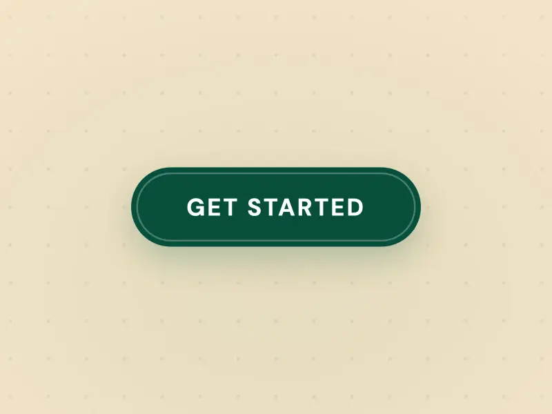
Spark Button
VanillaReact
An outlined button with a gradient border that sweeps diagonally from corner to corner on hover using a single clip-path transition and glow box-shadow — pure CSS, no JavaScript required for the effect.
#button#gradient#clip-path
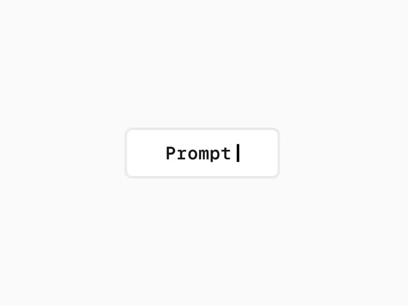
Typewriter Button
VanillaReact
A button that erases its idle label character by character and types in a confirmation label, with a blinking cursor that tracks the end of the visible text and a gradient border that draws around the button on hover.
#button#clip-path#animation
Ready to build?
300+ production-ready components and Atheros AI models. Every paid plan includes access to the whole Atheros — AI Builder and Learning.
Starting at $9.9 per month, billed annually