Expand Button
AI Pass+button#pill#gradient#animation
design.md
Preview
1280 px
AI Assistant

Grab the code for this component with a free account
Every free component’s full source, ready to copy or download, plus 30 monthly AI credits for Atheros AI routing to make it yours.
Code
Grab the code for this component with free account
Every free component's full source, ready to copy or download, plus 30 monthly AI credits for Atheros AI routing to make it yours.
Button component
About Expand Button
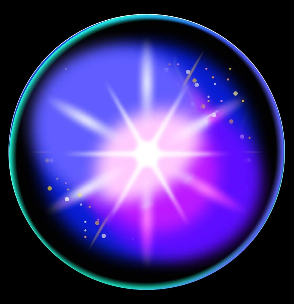
Circle icon button that morphs into a gradient pill on hover — the icon flies up as the label scales in, via a GPU-composited clip-path reveal.
Features
- Circle-to-pill morph: fixed-width button clipped to a centered circle via
clip-path: inset(); hover expands the clip symmetrically from the center to the full pill — GPU-composited equivalent of the original width animation, no layout shifts - Icon flies upward and fades out on hover via
transform: translateY(-200%)andopacity - Label scales in at the center via
transform: scale(0)→scale(1)plusopacity, reproducing the original font-size pop - Hover gradient uses the
button-expand(Magenta Bloom) design system, primary#C0268A— magenta→pink in light mode, brighter pink in dark mode (--bex-grad-start/--bex-grad-end) - Idle 1px border ring drawn by a dedicated
::aftercircle so the clipped shape keeps a full outline; it fades out as the pill expands - Ambient background glows tinted by the gradient endpoints, matching the original page in both themes
- Active press feedback via
transform: scale(0.95) - Keyboard-accessible —
:focus-visibletriggers the same expand animation as hover - Reduced-motion support via
prefers-reduced-motion: reduce
Accessibility
- Button label
aria-label="Retrain"on the<button>, visible label markedaria-hiddento avoid duplication- Icon hiding
aria-hidden="true"on all decorative SVGs- Keyboard activation
- Native
<button>semantics — responds toEnterandSpace - Focus retention
- Click-to-blur is gated on
:focus-visible, so keyboard activation keeps focus and the focus indicator on the button - Focus indicators
:focus-visibletriggers the full expand animation and gradient fill as the focus indicator- Reduced motion
prefers-reduced-motion: reducecollapses all animations to 0.01ms
Customise it with AI
Open Expand Button in Atheros AI Builder, pick a design system and ask the AI assistant to change the layout, copy or behaviour — the button is regenerated against your tokens. Take the HTML, CSS, JS and React source with you, or pull it into your repo from Claude Code, Cursor or Codex over MCP.
Explore Other Components
View all
Spark Button
VanillaReact
An outlined button with a gradient border that sweeps diagonally from corner to corner on hover using a single clip-path transition and glow box-shadow — pure CSS, no JavaScript required for the effect.
#button#gradient#clip-path

Circle Expand Button
VanillaReact
A gradient accent circle with a contrasting chevron arrow that expands into a full pill on hover, sweeping under the label — a faithful port of the original circle-expand button, animated with GPU-friendly `clip-path` + `transform: scaleX()` instead of a width transition.
#button#gradient#transform

Shine Button
ReactVanilla
A gradient button with a diagonal shine sweep animation that travels across the surface on hover, powered by GPU-composited `transform: translateX()` transitions — design-system agnostic.
#button#gradient#animation

Badge Arrow Button
VanillaReact
A pill button with a primary-color gradient circle badge that inverts on hover with a diagonal arrow slide animation — pure CSS transitions, no keyframes required.
#button#badge#gradient
Icon Swap Button
VanillaReact
A gradient pill button where the text label slides up and a download icon slides in from below on hover — driven entirely by GPU-composited `translateY` transitions with no layout recalculation.
#button#gradient#pill
Warp Button
VanillaReact
A bordered button that jumps to warp speed on hover — a rotating gradient ring, two parallax layers of light-streaks scrolling past, a one-shot jump-flash, and a "Launch" → "Ready" warp text-swap. All driven by CSS hover and focus states, fully design-system agnostic.
#button#gradient#glow
Ready to build?
300+ production-ready components and Atheros AI models. Every paid plan includes access to the whole Atheros — AI Builder and Learning.
Starting at $9.9 per month, billed annually