Split Mosaic
AI Pass+May 26, 2026278 views
layout#design-tokens#grid-areas#mosaic#responsive#skeleton#split
Preview

AI Assistant

Code editor locked. Unlock with Atheros AI Pass to open every file, copy, download, and customize it with AI.
Explore Other Components
View all
Card Grid
VanillaReact
A responsive card-grid bento — thirteen skeleton cards, each a distinct anatomy (KPI, stat, usage, banner, team, article, media hero, profile, product, tasks) placed with named `grid-template-areas` that reflow across four breakpoints, mobile-first and design-system agnostic.
#layout#card-grid#bento+4
14326

Tri-Sidebar
VanillaReact
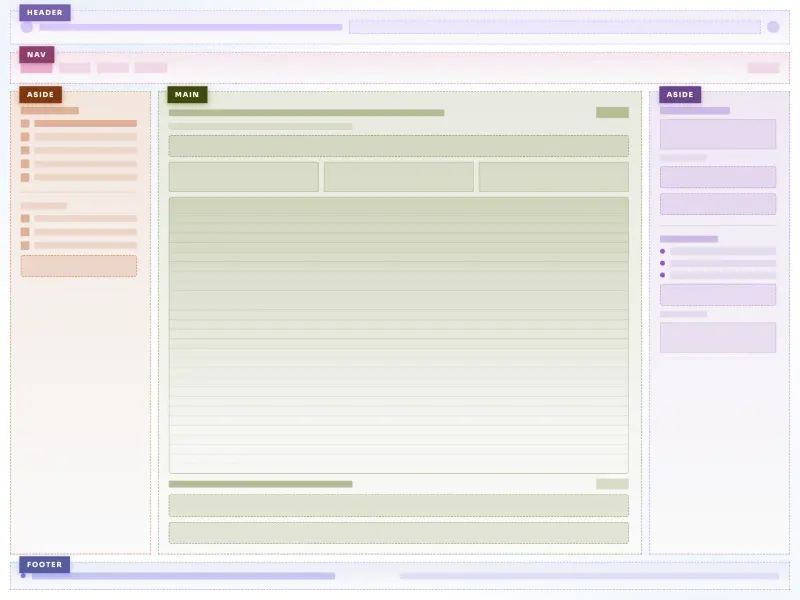
A tri-sidebar app-frame layout — a full-width header and footer wrap a left nav rail, a central main surface, a status strip, and a right widgets aside. Regions reflow from a single mobile column to the full three-column frame, mobile-first and design-system agnostic.
#layout#tri-sidebar#app-frame+4
3126