Tag Badge
VanillaReactLight & dark296 views
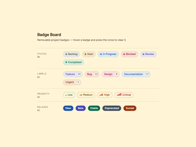
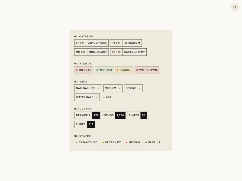
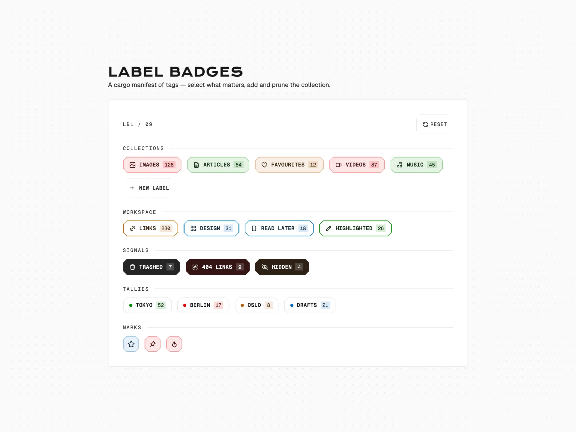
Removable tag chips in four style variants with inline add buttons, a fixed toolbar for design-system switching and reset, and dark-mode support.
badge#tag#pill#filter
Preview
1280 px
Atheros AI
Code
Get the code for free
Create a free account to copy or download the full source.
Badge component
About Tag Badge
Removable tag chips in four style variants with inline add buttons, a fixed toolbar for design-system switching and reset, and dark-mode support.
Features
- Four style variants as rows: **ghost** (subtle), **soft** (light fill), **outline** (1px border), **solid** (primary fill)
- Chip and × radii follow the active design system; the close hover radius is derived from the outer radius and inner padding so its fill stays visually contained
- Clicking × removes the chip with a fade + scale-down animation
- Inline dashed "+ Add" button per row appends a chip with a random label and a pop entrance
- Fixed toolbar in top-right with design-system switcher and reset button
- Design-system switcher retones the whole component across 39 brand themes at runtime
- Fully respects prefers-reduced-motion
Accessibility
- Remove button
- Real
<button aria-label="Remove …">;Enter/Spaceactivate;focus-visiblering - Add button
- Real
<button aria-label="Add … tag">; keyboard operable - Theme toggle
role="switch"witharia-checked, keyboard operable- DS switcher
- Native
<select>with<optgroup>labels andaria-label - Reset button
<button aria-label="Reset all tags">in toolbar- Focus indicators
:focus-visiblewith--ringoutline on all interactive elements- Reduced motion
prefers-reduced-motion: reducedisables all animations and transitions
Customise it with AI
Open Tag Badge in Atheros AI Builder, pick a design system and ask the AI assistant to change the layout, copy or behaviour — the badge is regenerated against your tokens. Take the HTML, CSS, JS and React source with you, or pull it into your repo from Claude Code, Cursor or Codex over MCP.
Explore Other Components
View all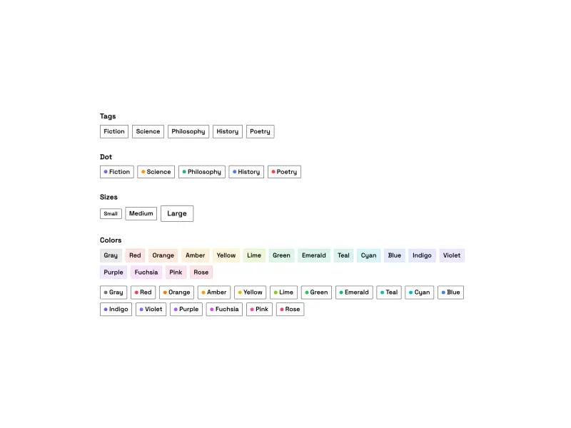
Ready to build?
300+ production-ready components and Atheros AI models. Every paid plan includes access to the whole Atheros — AI Builder and Learning.
Starting at $9.9 per month, billed annually