Outline Badges
Pass+VanillaReactLight & dark335 views
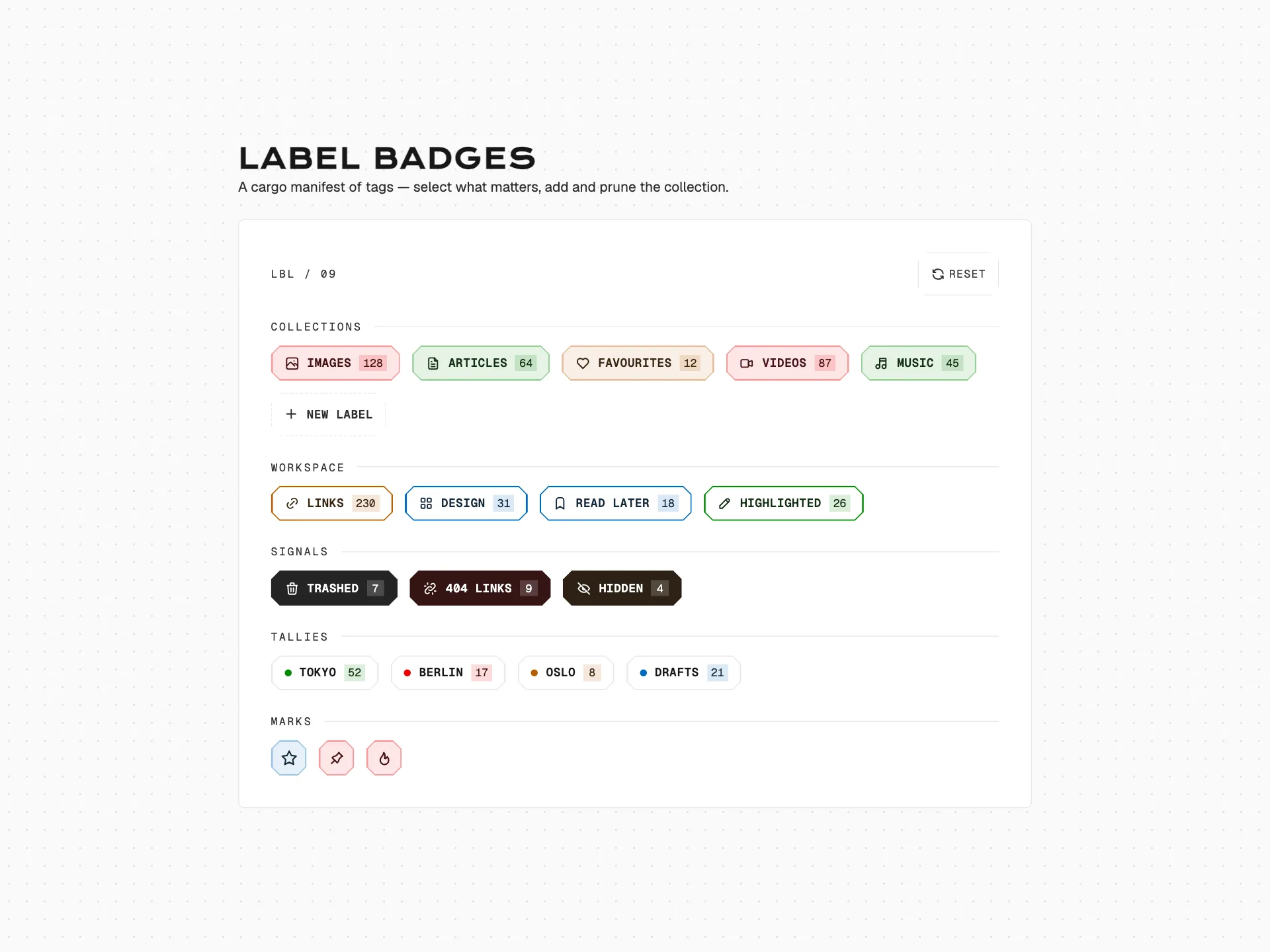
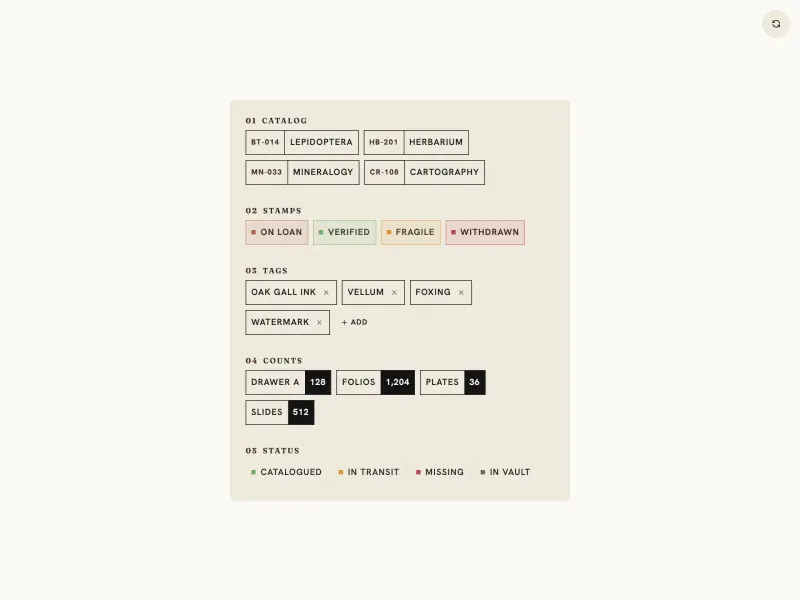
A colourful gallery of outlined category label badges — each fully-rounded pill has a transparent fill with an accent-tinted border, a leading Tabler icon, and an accent-coloured label, plus a row of icon-only mini badges. Every badge is individually selectable with a fill-on-select effect.
badge#pill#chip#tag
Preview
1280 px
Atheros AI
Code
Badge component
About Outline Badges
A colourful gallery of outlined category label badges — each fully-rounded pill has a transparent fill with an accent-tinted border, a leading Tabler icon, and an accent-coloured label, plus a row of icon-only mini badges. Every badge is individually selectable with a fill-on-select effect.
Features
- Accent palette (red, green, pink, blue, rose, lime, violet, teal, amber) defined as CSS custom properties with separate light and
body.darkvalues - Outline style: transparent fill plus an accent-coloured border built with
color-mix(in srgb, var(--accent) 42%, transparent); per-badge accent set via anob-{accent}modifier class - Selectable badges: clicking fills the pill with a faint accent tint, thickens the border, and adds a ring;
cursor: pointerandaria-pressedreflect state - A row of icon-only round mini badges below a divider, wrapping fluidly on narrow viewports
- Real Tabler icon paths only (viewBox
0 0 24 24, strokecurrentColor, stroke-width 2) - Fully token-driven, design-system agnostic, responsive to 320px, and respects
prefers-reduced-motion
Accessibility
- Badge selection
- Badges are
<button>elements witharia-pressedtoggled on click - Mini badges
- Icon-only buttons carry an
aria-labelnaming the icon - Theme toggle
role="switch"witharia-checked, operable via Enter and Space- Focus indicators
:focus-visibleoutline using the--ringtoken- Reduced motion
prefers-reduced-motion: reducecollapses all transitions
Customise it with AI
Open Outline Badges in Atheros AI Builder, pick a design system and ask the AI assistant to change the layout, copy or behaviour — the badge is regenerated against your tokens. Take the HTML, CSS, JS and React source with you, or pull it into your repo from Claude Code, Cursor or Codex over MCP.
Explore Other Components
View all
Ready to build?
300+ production-ready components and Atheros AI models. Every paid plan includes access to the whole Atheros — AI Builder and Learning.
Starting at $9.9 per month, billed annually