Inkline Sign In
AI Pass+login#form#validation
design.md
Preview
1280 px
AI Assistant

Grab the code for this component with a free account
Every free component’s full source, ready to copy or download, plus 30 monthly AI credits for Atheros AI routing to make it yours.
Code
Grab the code for this component with free account
Every free component's full source, ready to copy or download, plus 30 monthly AI credits for Atheros AI routing to make it yours.
Login component
About Inkline Sign In
A two-column editorial sign-in for Inkline: underline-only fields with floating labels, a drawn accent focus line, JetBrains Mono state glyphs (› ✓ !) and a password strength meter living inside the underline itself, beside a ruled panel — tinted with the active design system's accent — carrying a paper testimonial card.
Features
- The quote remains a subtly accent-tinted paper card while its surface and ink follow the active theme.
- Underline-only "ink" fields — no boxes: a resting hairline with an ink line that draws in from the left (
transform: scaleX) on focus - Floating labels that live on the line and rise with a springy
cubic-bezier(0.3, 1.4, 0.4, 1)transform when the field is focused or filled - Leading JetBrains Mono state glyph per field —
›at rest (ink-teal while focused), cross-fading to✓on:user-validand!on:user-invalid - Password strength meter integrated into the underline — the line itself fills proportionally (¼ steps) and re-tints error → warning → primary → success, with a polite mono
aria-livereadout (weak → strong) - Real HTML5 validation surfaced through
:user-invalid— inline error text only appears after a field is touched, wired viaaria-describedbyandaria-invalid - Show/hide password toggle with an accessible
aria-pressedbutton and inline Tabler eye icons - Caps-Lock warning on the password field via
KeyboardEvent.getModifierState('CapsLock')and a politearia-livehint - Remember-me checkbox that persists the email to
localStorageand restores it (pre-floating the label) on the next visit - Submit is intercepted with
preventDefault— it validates, runs a simulated async flow (spinner → success confirmation in arole="status"live region), and never navigates - Google and Apple continue buttons carrying the official brand marks — the multicolour Google “G” and the monochrome Apple silhouette (currentColor, so it stays legible in dark) — with accessible labels
- Deep inky aside styled as a ruled journal page, tinted with the active design system's accent — layered aurora gradients, fine ink rules, a ledger margin line, a drawn returns sparkline (SVG stroke-dash), a paper quote card with a real reader portrait, and a mono returns-stat chip
- Springy
scale(0.97)press feedback on all buttons - Full dark-mode token set (
body.dark) ready for the host shell to drive; the aside keeps its deep inky journal look in both themes - Staggered fade-and-slide entrance cascading each form section and the aside's eyebrow, quote card and stat into view (the gradient panel itself never animates, so it always paints)
Accessibility
- Form labels
- Every input has an associated
<label>viafor/id— the floating label is the real label - Autocomplete
emailandcurrent-passwordon the respective fields- Live status
role="status"witharia-live="polite"for the confirmation- Field errors
- Each input wires
aria-describedbyto its error text and togglesaria-invalidon input/blur - Validation
- Native
:user-invalidstyling — glyph, underline and text change together, never color alone - Password reveal
aria-pressedbutton with anaria-labelthat swaps between Show and Hide- Password strength
- Underline fill paired with a polite mono
aria-livetext readout, not color alone - Caps-Lock warning
- Polite
aria-livehint driven bygetModifierState('CapsLock'), cleared on blur - State glyphs
- Decorative
›/✓/!spans arearia-hidden— state is announced viaaria-invalidand error text - Focus indicators
- Global
:focus-visibleoutline plus the drawn underline on field focus - Reduced motion
prefers-reduced-motion: reducedisables all animations
Customise it with AI
Open Inkline Sign In in Atheros AI Builder, pick a design system and ask the AI assistant to change the layout, copy or behaviour — the login is regenerated against your tokens. Take the HTML, CSS, JS and React source with you, or pull it into your repo from Claude Code, Cursor or Codex over MCP.
Explore Other Components
View all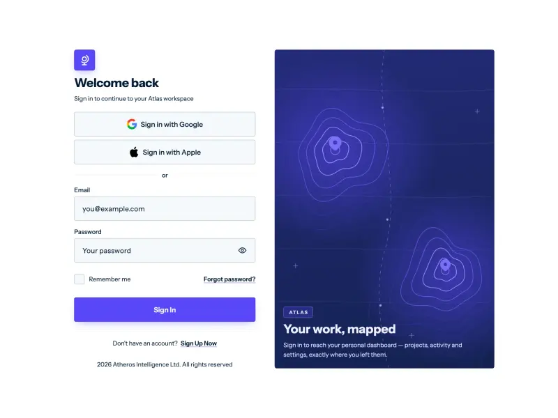
Atlas Login
VanillaReact
A two-column Atlas login: a bare Poppins form with pill OAuth rows, email and password fields (live `:user-invalid` validation, reveal toggle, Caps-Lock hint), remember-me and a springy pill submit, beside a deep accent panel of JS-rendered drifting topographic contour art.
#login#authentication#form
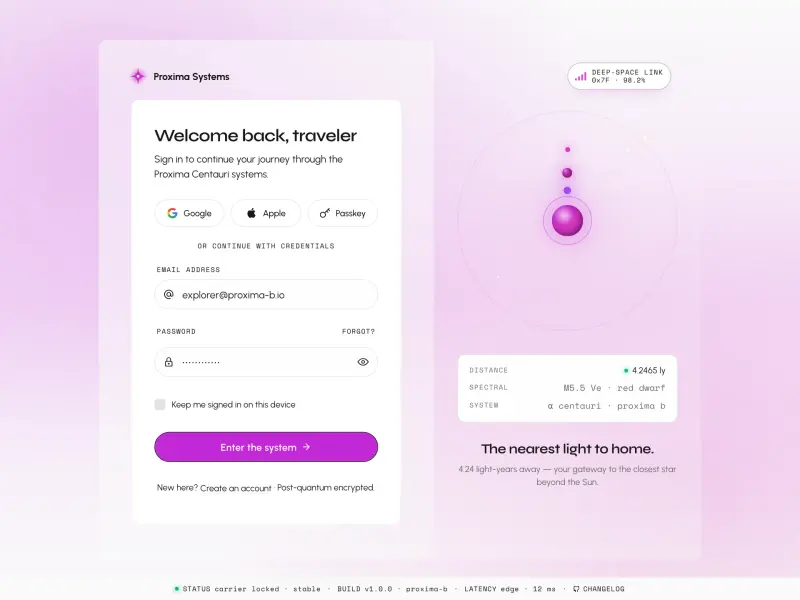
Login — Proxima
VanillaReact
A cosmic split-screen login with Proxima Centauri orbital visualization, social sign-in (Google, Apple, Passkey), real-time email and password validation, animated star-field background, and a full HUD status bar — fully token-driven and design-system agnostic.
#login#form#validation
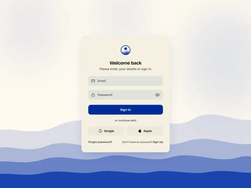
Login — Waves
VanillaReact
A cinematic login card floating over slow-drifting ocean waves and blurred blobs, with floating-label inputs, password validation, a show/hide toggle, and social sign-in.
#login#form#validation
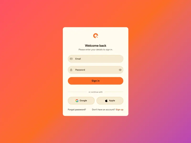
Gradient Login Form
VanillaReact
A polished sign-in card floating on a full-viewport diagonal gradient, with a brand logo, real-time email and password validation, inline error messaging, a password visibility toggle, and social sign-in buttons — fully token-driven and design-system agnostic.
#login#form#validation
Spec Sheet
VanillaReact
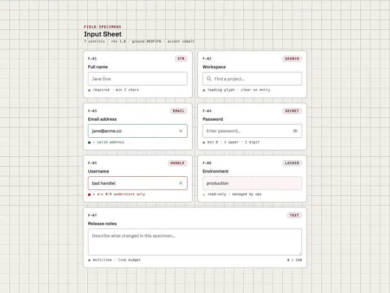
Machined field specimens on a cool ground: boxed inputs annotated with monospace serials, type tags, and live state ticks, held by a single accent. Leading icons, clear buttons, password reveal, a counted textarea, and live per-field validation announced through aria-live.
#input#validation#password
One-Time Code Input
VanillaReact
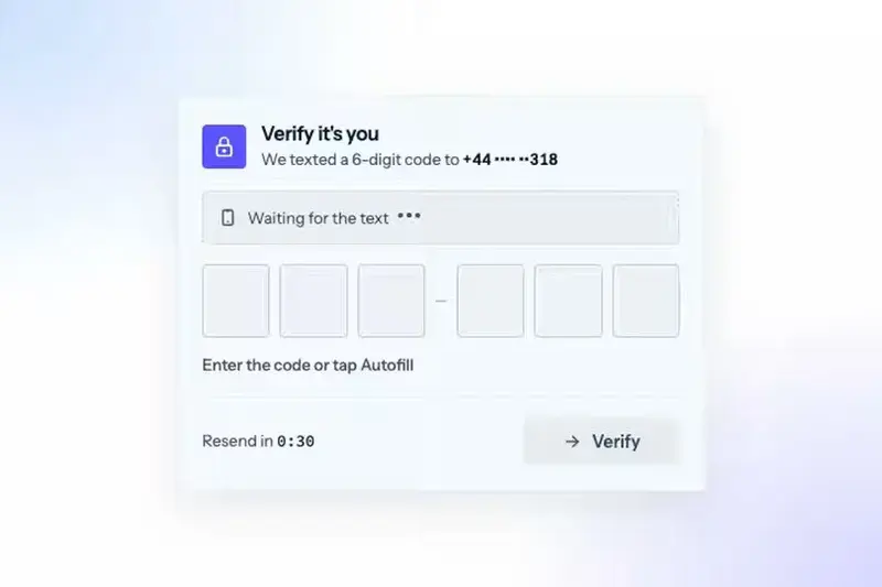
A one-time code input for sign-ins, 2FA and email verification. Six digit boxes share one real input, a focus ring glides to the next box as you type, the texted code arrives with an Autofill chip, a wrong code shakes and clears, and the right one ripples green box by box.
#input#login#password
Ready to build?
300+ production-ready components and Atheros AI models. Every paid plan includes access to the whole Atheros — AI Builder and Learning.
Starting at $9.9 per month, billed annually