Spec Sheet
AI Pass+input#validation#password
design.md
Preview
1280 px
AI Assistant

Grab the code for this component with a free account
Every free component’s full source, ready to copy or download, plus 30 monthly AI credits for Atheros AI routing to make it yours.
Code
Grab the code for this component with free account
Every free component's full source, ready to copy or download, plus 30 monthly AI credits for Atheros AI routing to make it yours.
Input component
About Spec Sheet
Machined field specimens on a cool ground: boxed inputs annotated with monospace serials, type tags, and live state ticks, held by a single accent. Leading icons, clear buttons, password reveal, a counted textarea, and live per-field validation announced through aria-live.
Features
- Each field is a machined specimen cell: a hairline-boxed input on a lifted white card, annotated with a monospace serial (
F-01), an uppercase type tag, and a live state tick - Leading-icon and trailing-action variants — search glyph, inline clear button, and password reveal toggle
- Clear buttons fade in only once a field holds a value (
:not(:placeholder-shown)), driven by opacity only - Password visibility toggle swaps eye-open and eye-closed icons via a class and reports
aria-pressed - Live validation for name, email, password, and username, recoloring the field border, the state tick, and the mono readout
- Success and error readouts are announced through
role="status"+aria-live="polite"regions - Counted textarea with a live monospace character budget that shifts to cobalt near the limit
- Disabled state dims the specimen and blocks interaction
- Focus, reveal, and state transitions use
opacity,transform,color, andbox-shadowonly — never layout properties - Fully respects
prefers-reduced-motion
Accessibility
- Labels
- Every input has an associated
<label for> - Descriptions
- Each field is wired to its readout via
aria-describedby - Live validation
- Readouts use
role="status"+aria-live="polite"; invalid fields setaria-invalid - Password toggle
- Real
<button>witharia-labelandaria-pressed - Clear buttons
- Real
<button>with a field-specificaria-label - Focus indicators
:focus-visibleoutline plus a cobalt field halo- Reduced motion
prefers-reduced-motion: reducedisables all animations
Customise it with AI
Open Spec Sheet in Atheros AI Builder, pick a design system and ask the AI assistant to change the layout, copy or behaviour — the input is regenerated against your tokens. Take the HTML, CSS, JS and React source with you, or pull it into your repo from Claude Code, Cursor or Codex over MCP.
Explore Other Components
View all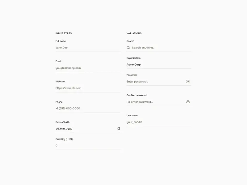
Text Input
VanillaReact
Token-driven text inputs with a borderless bottom-line style, animated focus underlines, leading icons, password visibility toggles, live per-field validation, dark mode, and a responsive two-column layout.
#input#password#validation
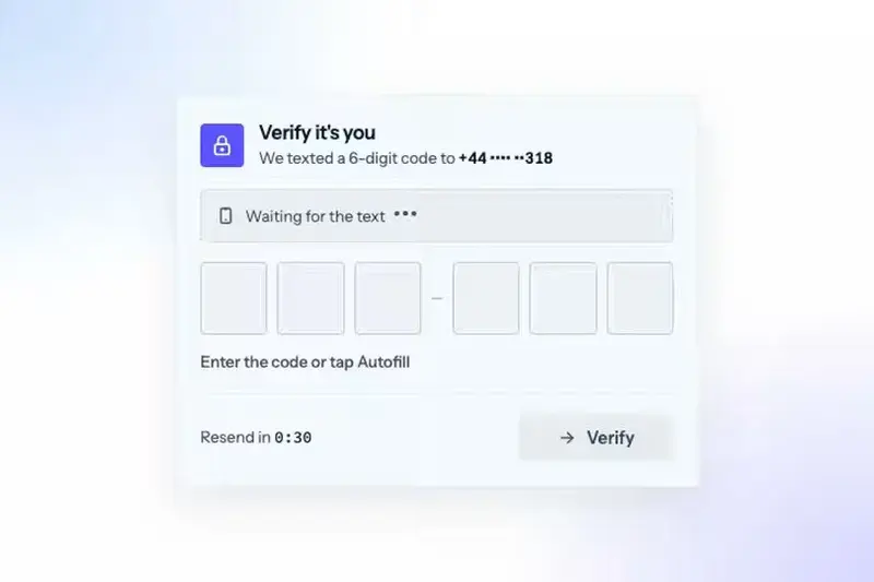
One-Time Code Input
VanillaReact
A one-time code input for sign-ins, 2FA and email verification. Six digit boxes share one real input, a focus ring glides to the next box as you type, the texted code arrives with an Autofill chip, a wrong code shakes and clears, and the right one ripples green box by box.
#input#login#password
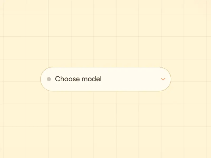
Model Select
ReactVanilla
A bare token-driven custom select for picking an AI model — a checkbox-toggled dropdown with a gradient-ringed trigger, colored brand dots per model, staggered option reveal, backdrop click-away, and full keyboard support — themed by the AI Steppers design system in both light and dark.
#input#select#dropdown
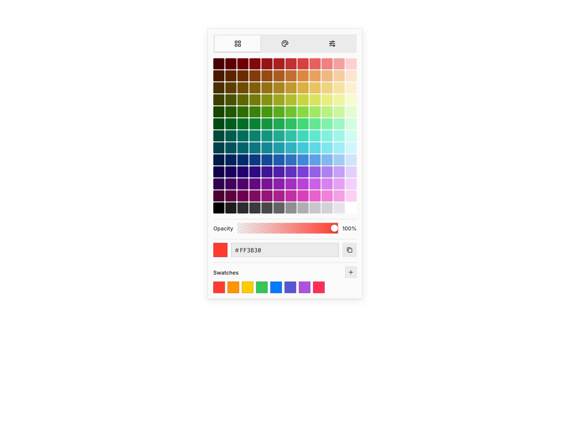
Color Picker
ReactVanilla
An iOS-style color picker with grid, spectrum, and RGB slider tabs, an opacity control, a hex input with alpha, and saved swatches — fully token-driven and design-system agnostic.
#input
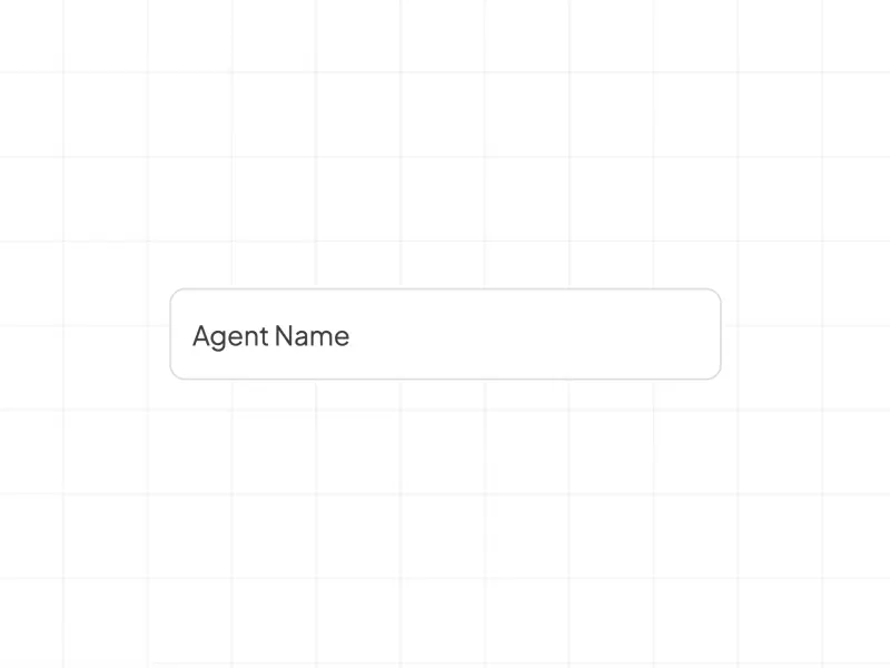
Floating Field
VanillaReact
A bare token-driven text input with a floating "Agent Name" label that rests inside the field and rises above it on focus or when filled, a design-system focus border, and readable accent label text in light and dark.
#input
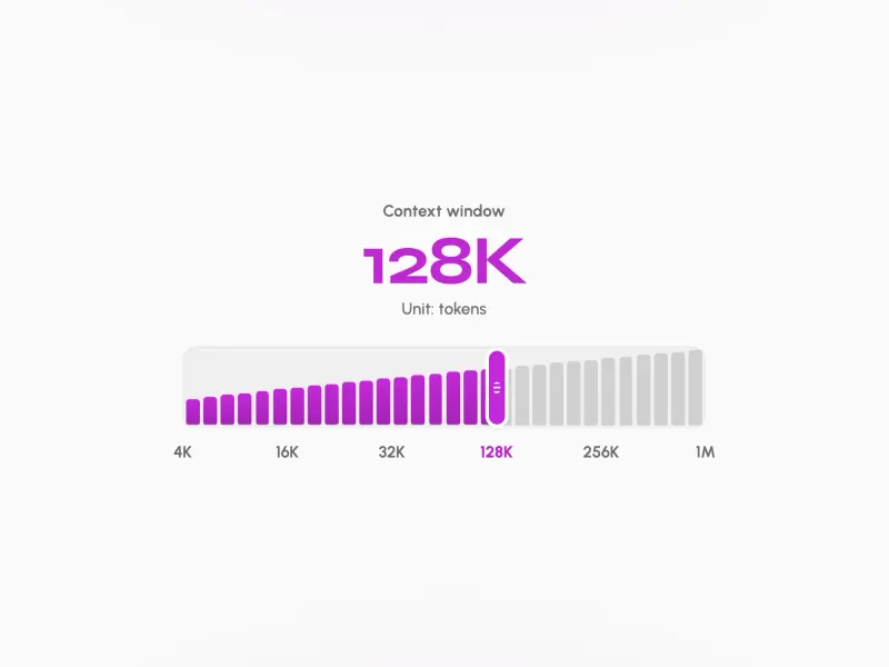
Context Picker
ReactVanilla
A bare token-driven context window size picker — a radiogroup of six options (4K, 16K, 32K, 128K, 256K, 1M tokens) where each option stacks miniature page bars that light up with the brand gradient when selected — themed by the AI Steppers design system in both light and dark.
#input#radio
Ready to build?
300+ production-ready components and Atheros AI models. Every paid plan includes access to the whole Atheros — AI Builder and Learning.
Starting at $9.9 per month, billed annually