Template Gallery
/
10 matching templates
Profile Dropdown Menu
VanillaReact
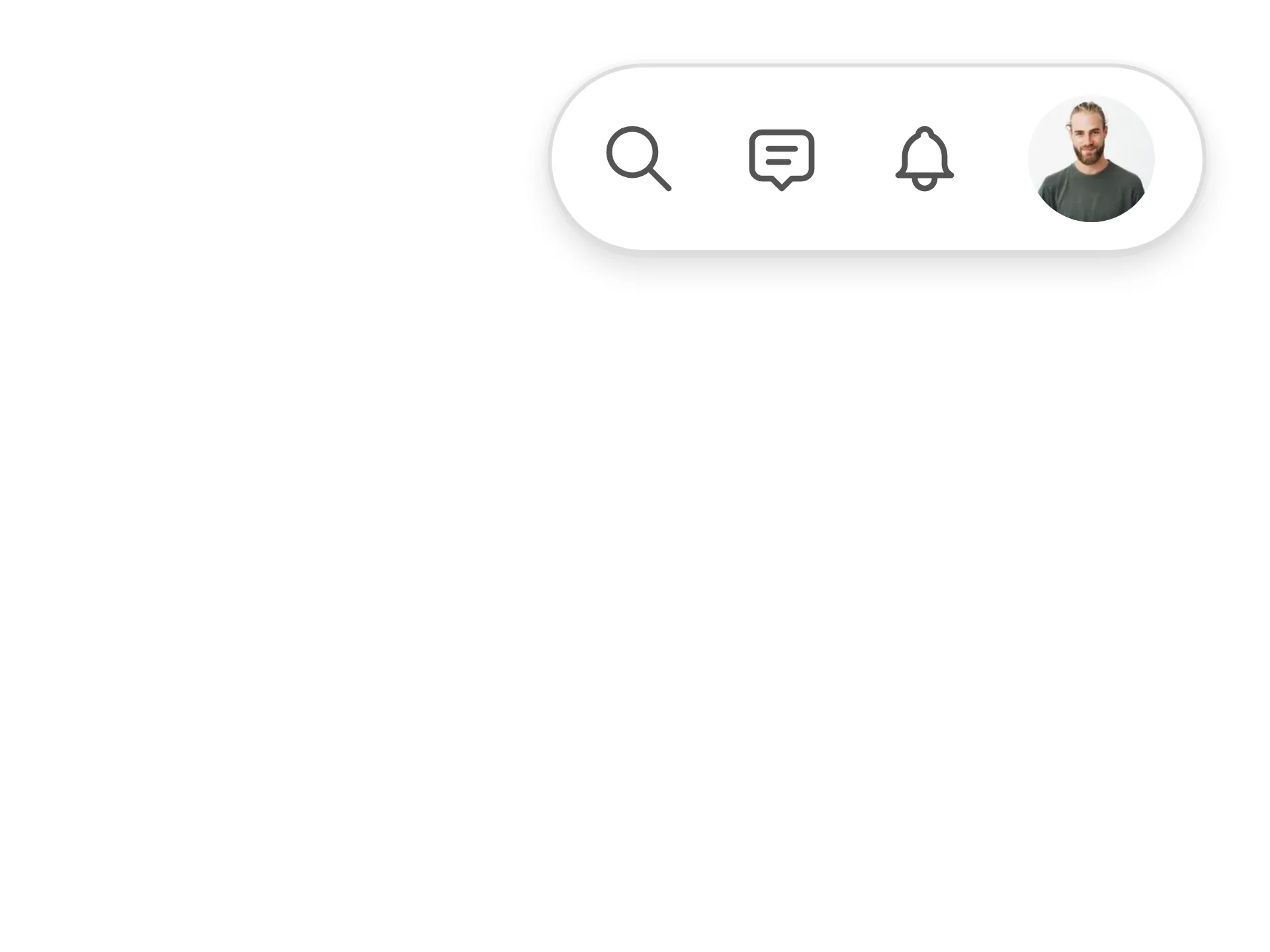
A profile dropdown led by an identity header for the signed-in account, with quick actions and soft key-chip shortcut hints, a What's new discovery item, a switch-account list of the other accounts with a hover switch arrow, a dark mode toggle row grouped above the error-weighted sign-out action — fully token-driven and design-system agnostic.
#dropdown-menu#dropdown#menu+4
1041207
Glass Profile
VanillaReact
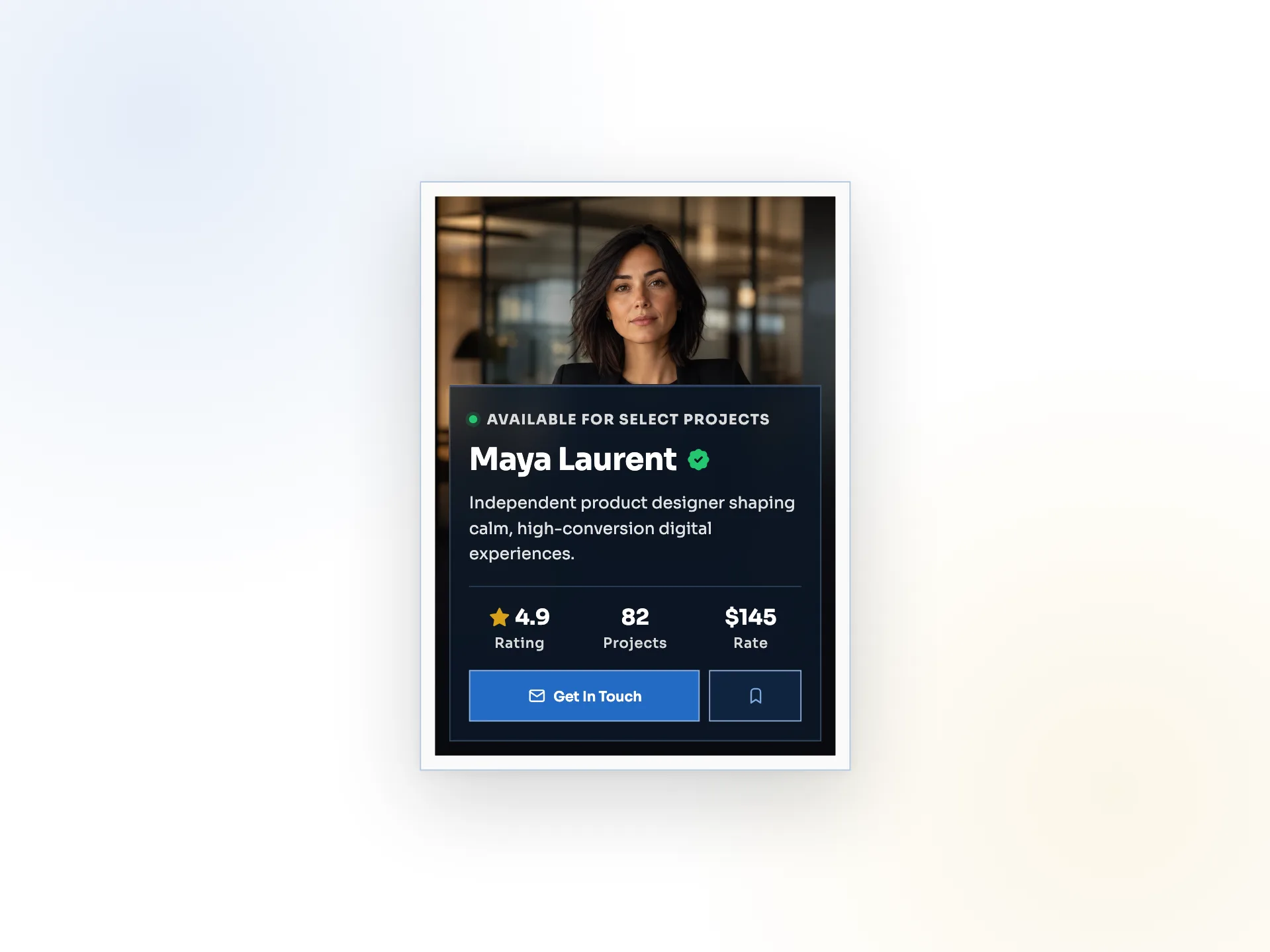
A glassmorphism profile card — a full-bleed portrait is the surface and a translucent dark scrim panel carries the name, verified badge, bio, highlight stats, and compact CTAs, with a photo-to-initials fallback.
#card#profile#glassmorphism+3
758
Mentor Tabs
VanillaReact
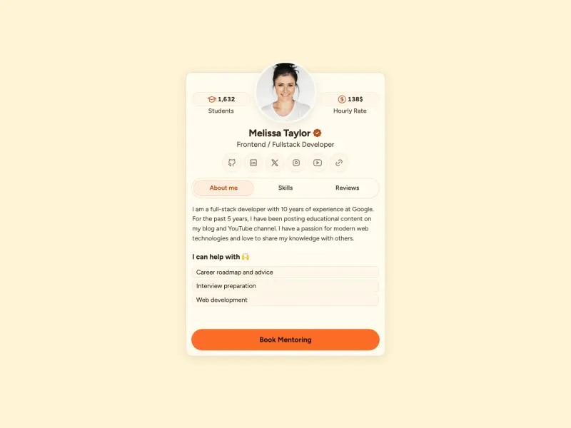
A data-driven mentor profile card: flanking Students and Hourly Rate stat badges frame an overlapping avatar, a verified name sits above a centered social row, and a keyboard-navigable About / Skills / Reviews tab strip swaps panels behind a sliding lavender indicator.
#profile#mentor#card+4
13356
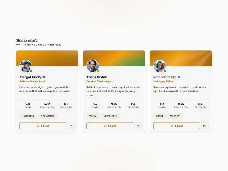
Profile Card
VanillaReact
An editorial profile card gallery in the Nordmist design system — real portraits, skeleton loading, tabular stats, skill chips, and a follow toggle that persists across reloads, all rendered from an async API seam. Sora display type over Inter body on an icy blue-grey fog canvas.
#profile#cards#avatar+3
4203
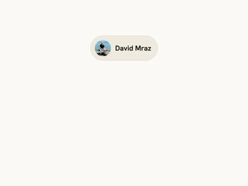
User Card Popover
ReactVanilla
A profile hover card anchored to an avatar trigger, showing a photo avatar, name, handle, follower stats and a Follow button that toggles state — with viewport-aware positioning, opening on click and closing on Escape, focus-out or outside click.
#popover#user-card#profile+2
14284
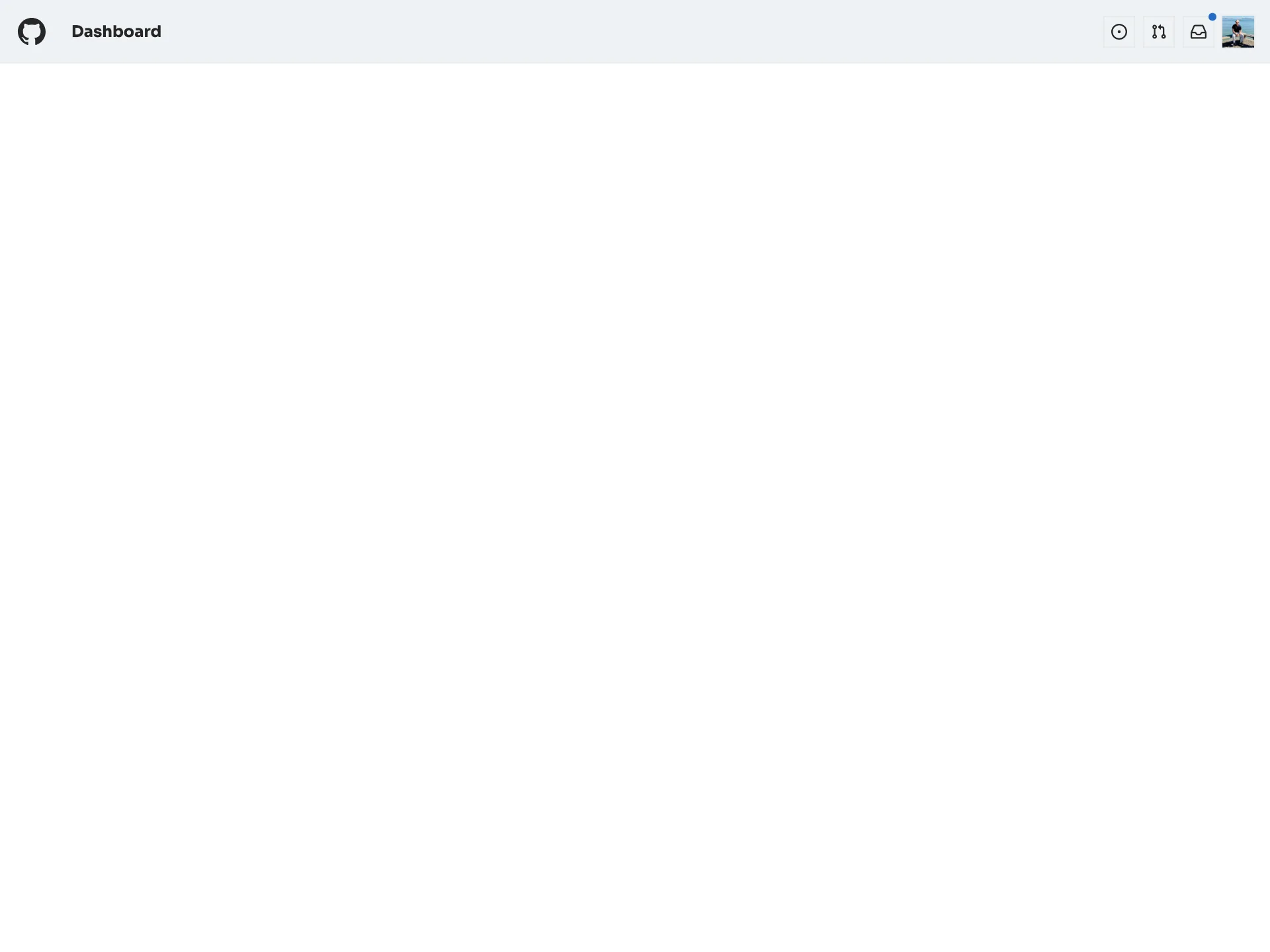
Profile Drawer
VanillaReact
A GitHub-light fixed top bar — a mark logo, a Dashboard title, Octicon action buttons with an unread inbox dot and an avatar — that opens a right-side profile drawer of menu links, closing on Escape, outside-click or the X with focus returned to the avatar trigger.
#menu#navigation#drawer+4
45931
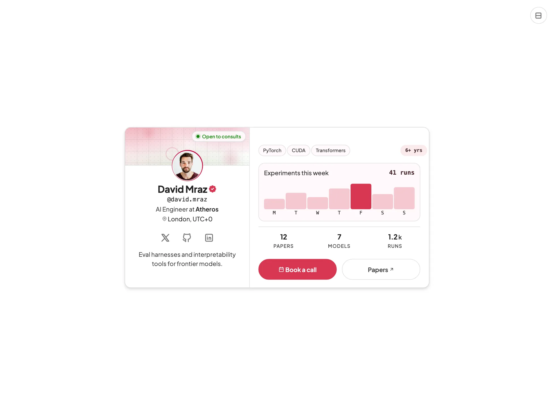
Profile Stats
ReactVanilla
An AI-engineer profile card with a ringed avatar, identity block, social links, skill chips, an interactive weekly activity sparkline, a stats grid, and a vertical/horizontal layout toggle — token-driven and design-system agnostic.
#profile#card#stats+4
38740
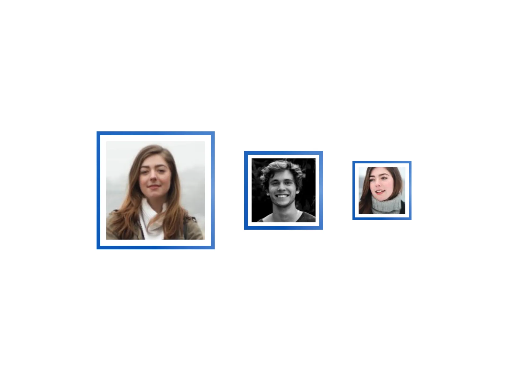
Avatar Gradient Border
VanillaReact
Figtree profile avatars framed by animated gradient rings, with multiple sizes and theme-aware colors.
#avatar#gradient#profile+2
293
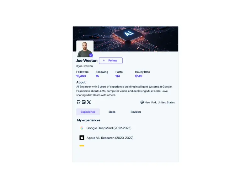
Social Profile Tabs
VanillaReact
A social profile card with a verified avatar, a stateful Follow toggle (outlined fills on hover, plus rotates, red unfollow), a four-stat count-up row animated on scroll, an about block with socials and location, and a tabbed Experience/Skills/Reviews panel with a sliding active-tab indicator.
#profile#card#tabs+4
673107
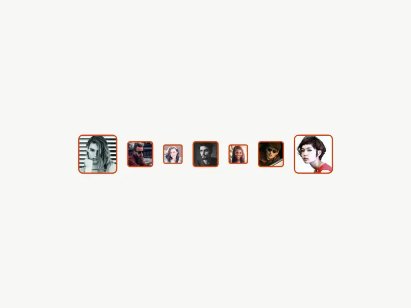
Avatar Square Rounded
VanillaReact
Rounded-square profile avatars with size variants, fallback initials, and theme-aware styling.
#avatar#rounded#profile+2
3330
Ready to build faster?
Full access to AI Component Builder: 300+ production-ready components, all top-tier AI models with transparent per-use pricing. Every paid plan includes full Atheros Platform access with courses, tutorials, and challenges.
Starting at $15/month + VAT