Select
Pass+VanillaReactLight & dark260 views
Three token-driven listbox fields — single-select, multi-select with a Select all row, and a searchable multi-select — each a button trigger paired with a popup listbox, with full keyboard navigation, type-ahead, dark mode, and a responsive grid.
input#combobox#multi-select#search
Preview
design.md
1280 px
Atheros AI
Code
Get the code for free
Create a free account to copy or download the full source.
Input component
About Select
Three token-driven listbox fields — single-select, multi-select with a Select all row, and a searchable multi-select — each a button trigger paired with a popup listbox, with full keyboard navigation, type-ahead, dark mode, and a responsive grid.
Features
- Three independent fields on one stage, each driven by a
data-modeattribute:single,multi, andsearch - Single-select mode commits a value to the trigger label and closes the popup, marking the chosen row with a filled radio disc
- Multi-select mode keeps the popup open, tracks chosen values in a
Set, lists the chosen values on the trigger label, and shows a count badge with a clear-all affordance - Selected rows carry a primary-tinted background with an inset accent bar in addition to their filled radio/check marker, so every chosen option reads as selected at a glance
- Select all row with a three-state check: empty, filled tick when everything is chosen, and a dash when the selection is partial
- Search mode filters options as you type and scopes Select all to the rows currently visible
- Full keyboard navigation: arrows, Home, End, Enter, Space, Escape, Tab, and type-ahead matching on the option value
- Opening one field closes the other two; all fields close on outside click
- Reveal animation driven by
opacityandtransformonly — never layout properties - Fully respects
prefers-reduced-motion
Accessibility
- Combobox role
- Single and multi triggers are
role="combobox"witharia-haspopup="listbox",aria-controls, andaria-expanded - Listbox semantics
role="listbox"containingrole="option"items witharia-selected; multi and search listboxes addaria-multiselectable- Active descendant
aria-activedescendanton the focused element — the trigger, or the search input when present — tracks the highlighted option and is dropped when the highlight clears- Search field
- Labelled via
aria-labeland wired to its listbox witharia-controls - Accessible names
- Each trigger carries an
aria-labeldescribing the field - Focus indicators
:focus-visiblewith--ringoutline on all interactive elements- Reduced motion
prefers-reduced-motion: reducedisables all animations
Customise it with AI
Open Select in Atheros AI Builder, pick a design system and ask the AI assistant to change the layout, copy or behaviour — the input is regenerated against your tokens. Take the HTML, CSS, JS and React source with you, or pull it into your repo from Claude Code, Cursor or Codex over MCP.
Explore Other Components
View all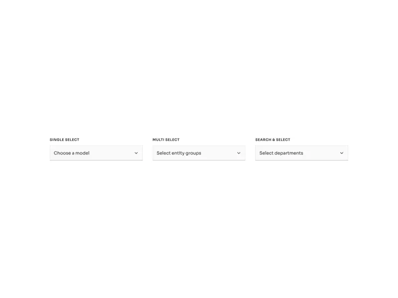
Ready to build?
300+ production-ready components and Atheros AI models. Every paid plan includes access to the whole Atheros — AI Builder and Learning.
Starting at $9.9 per month, billed annually