Overlay Nav
AI Pass+menu#navigation#overlay
design.md
Preview
1280 px
AI Assistant

Grab the code for this component with a free account
Every free component’s full source, ready to copy or download, plus 30 monthly AI credits for Atheros AI routing to make it yours.
Code
Grab the code for this component with free account
Every free component's full source, ready to copy or download, plus 30 monthly AI credits for Atheros AI routing to make it yours.
Menu component
About Overlay Nav
A design-system-aware marketing navbar with a wordmark, animated-underline links and a primary CTA on desktop; on mobile a burger opens a viewport navigation layer with staggered display-size links, a focus trap over an inert background, Escape close, scroll lock and desktop auto-close.
Features
- The logo glyph follows the proven text-on-surface pair. Desktop navigation links retain a minimum 24px interaction height, while
--buttons-radius, capped at half the control height, gives the CTA and the burger/close pair an exact capsule on pill systems and the system's own corner everywhere else. - Semantic
<header>with a<nav aria-label="Primary">primary navigation bar - Full-screen overlay menu (
role="dialog"+aria-modal) opened by a burger witharia-expanded,aria-controlsandaria-haspopup="dialog" - Bar links and overlay links share mono
01-04index numerals; overlay links reveal with a staggered transform/opacity transition - Real focus trap while the overlay is open — Tab and Shift+Tab cycle only the visible links and buttons, focus returns to the burger on close
- The header bar is made
inertwhile the overlay is open, so background controls are unreachable - Escape closes the overlay and body scroll is locked while it is open
- Resizing past the desktop breakpoint with the overlay open auto-closes it and releases the scroll lock
- Outline CTA repeated inside the overlay footer next to a contact link
- Icons are real 24x24 Tabler glyphs drawn with
currentColor - Fully respects
prefers-reduced-motion
Accessibility
- Navigation landmark
<nav aria-label="Primary">wraps the nav list,<nav aria-label="Overlay">inside the dialog- Overlay dialog
role="dialog"+aria-modal="true"+aria-labelon the overlay- Burger control
<button aria-expanded aria-controls aria-haspopup="dialog">with a swappedaria-label- Focus trap
- Tab and Shift+Tab wrap across the visible overlay controls; focus moves to the close button on open and returns to the burger on close
- Inert background
- The header row is
inertwhile the dialog is open, so nothing behind the overlay is reachable - Escape support
- Escape closes the overlay from anywhere in the document
- Breakpoint safety
- Crossing to the desktop layout auto-closes the overlay and releases the scroll lock
- Decorative icons
- Icon spans and the overlay brand marked
aria-hidden="true" - Focus indicators
:focus-visibleoutlines —--ringin the header, accent outlines inside the dark overlay- Reduced motion
prefers-reduced-motion: reducedisables all animations
Customise it with AI
Open Overlay Nav in Atheros AI Builder, pick a design system and ask the AI assistant to change the layout, copy or behaviour — the menu is regenerated against your tokens. Take the HTML, CSS, JS and React source with you, or pull it into your repo from Claude Code, Cursor or Codex over MCP.
Explore Other Components
View all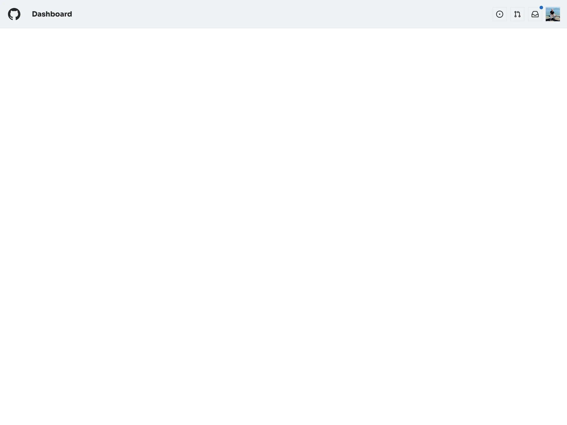
Profile Drawer
VanillaReact
A GitHub-light fixed top bar — a mark logo, a Dashboard title, Octicon action buttons with an unread inbox dot and an avatar — that opens a right-side profile drawer of menu links, closing on Escape, outside-click or the X with focus returned to the avatar trigger.
#menu#navigation#profile
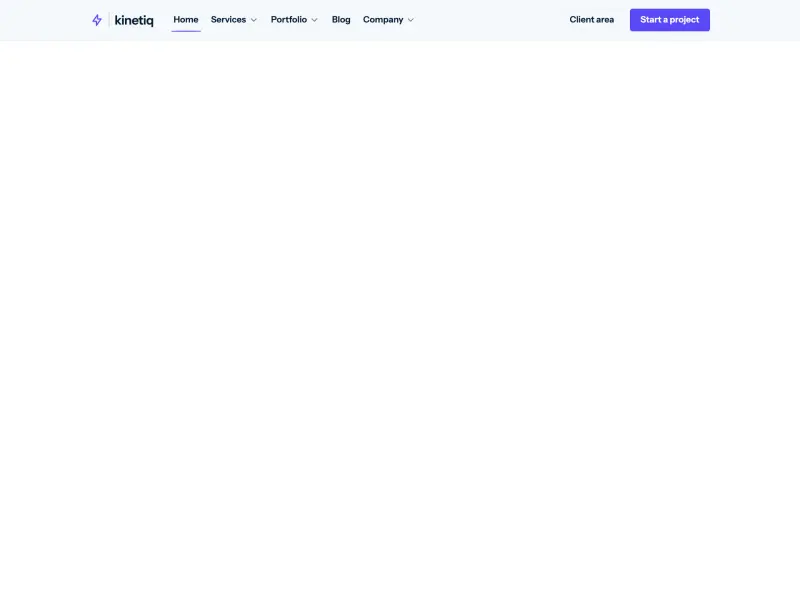
Subnav Bar
VanillaReact
An agency navbar with a shared morphing flyout: Services, Portfolio, and Company swap icon-and-description panels inside one sliding container with direction-aware cross-fades, a sliding indicator, featured promo cells, mono keyboard hints, and a staggered mobile drawer.
#menu
Modal — Aperture
VanillaReact
An accessible observatory-style dialog that opens through an animated circular aperture, with keyboard support and light and dark themes.
#modal#dialog#animation
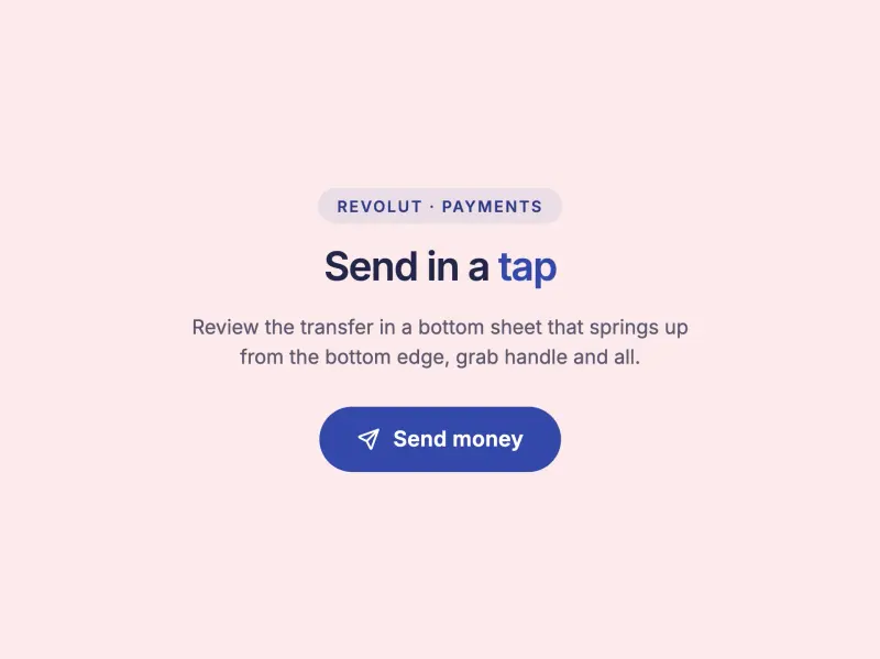
Modal — Bottom Sheet
VanillaReact
An accessible mobile-app bottom sheet that springs up from the bottom edge with a grab handle, an amount summary, and list-rows instead of a paragraph — a fintech payment-confirmation sheet themed by the Neovault design system (inspired by Revolut), with a full-width pill CTA and full keyboard.
#modal#dialog#animation
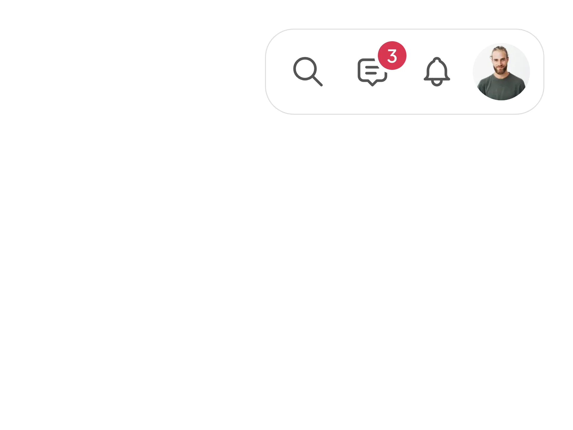
Profile Dropdown Menu
ReactVanilla
A profile dropdown led by an identity header for the signed-in account, with quick actions and soft key-chip shortcut hints, a What's new discovery item, a switch-account list of the other accounts with a hover switch arrow, a dark mode toggle row grouped above the error-weighted sign-out action — fully token-driven and design-system agnostic.
#account-switcher#dark-mode#responsive
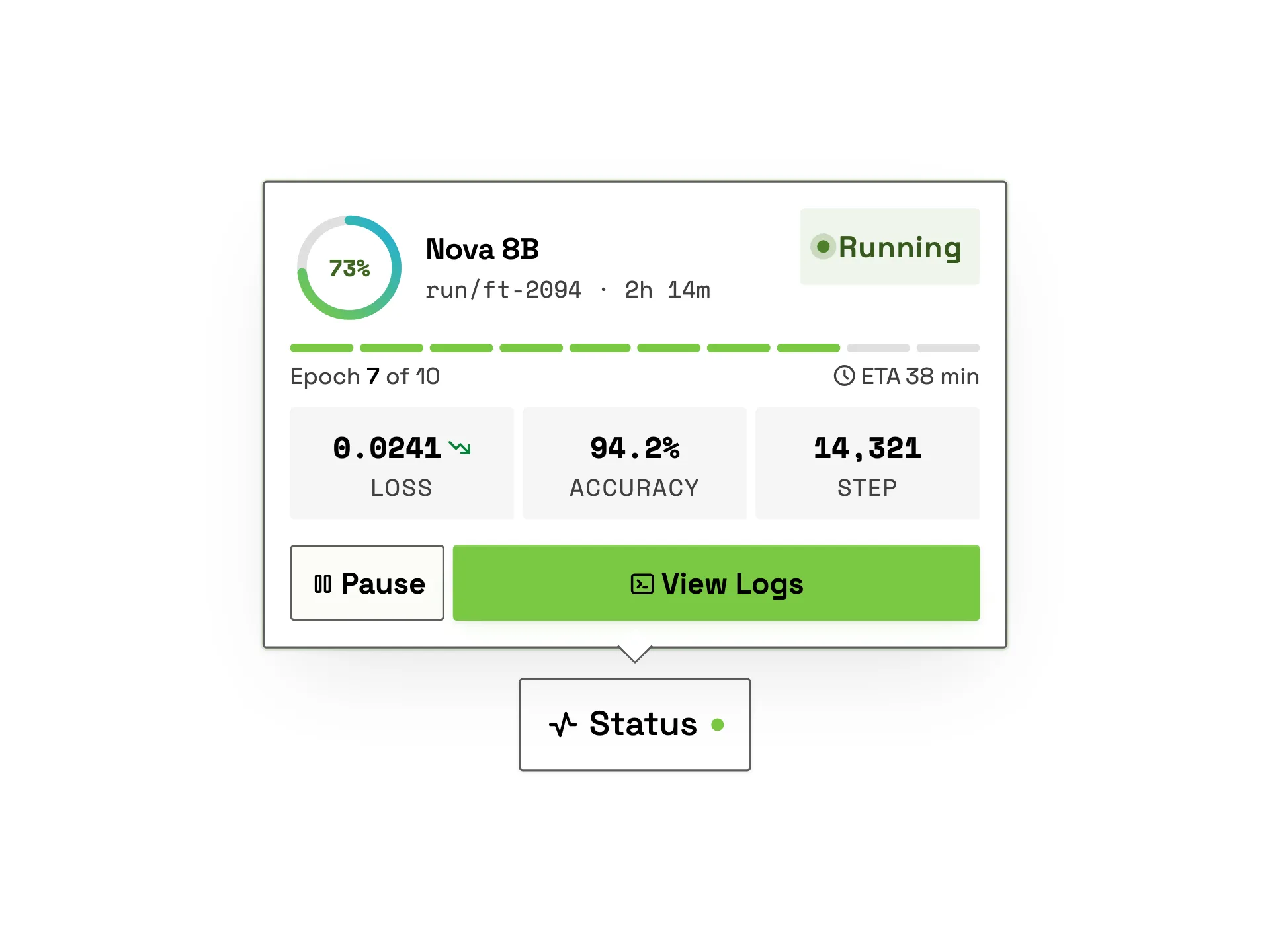
Training Status Popover
VanillaReact
A premium model training-status popover: a gradient progress ring with live percentage count-up, a running status badge with pulsing dot, an epoch segment strip with ETA, live loss/accuracy/step metric tiles and pause / view-logs actions, revealed from a trigger with staggered entrance.
#popover#progress#ai
Ready to build?
300+ production-ready components and Atheros AI models. Every paid plan includes access to the whole Atheros — AI Builder and Learning.
Starting at $9.9 per month, billed annually