Action Menu
AI Pass+dropdown-menu#menu
design.md
Preview
1280 px
AI Assistant

Grab the code for this component with a free account
Every free component’s full source, ready to copy or download, plus 30 monthly AI credits for Atheros AI routing to make it yours.
Code
Grab the code for this component with free account
Every free component's full source, ready to copy or download, plus 30 monthly AI credits for Atheros AI routing to make it yours.
Dropdown Menu component
About Action Menu
A deployment action menu opened by a bolt icon button: a short fade-and-scale open from the trigger, one shared highlight plate that glides between rows with an accent halo, a detached marker pill and an Enter hint, a destructive row that re-tones the plate, and full WAI-ARIA keyboard navigation.
Features
- Menu-button pattern:
aria-haspopup,aria-expanded,aria-controls,role="menu"/role="menuitem" - Open: opacity plus
scale(0.97)from the trigger corner, 200ms ease-out; close: 140ms ease-in - Rows and rules fade in 14ms apart
- One shared hover plate moves between rows by
transform; it carries a soft accent halo behind the row icon, a short detached accent pill at the leading edge, and an Enter glyph at the trailing edge - The plate cross-fades to the error tone on the destructive row and follows keyboard focus too
- The plate rests on the first row as soon as the menu opens and stays on the last row when the pointer leaves, so the accent is always visible
- The active row's icon takes the text ink; icons never rotate, scale or shift
- Choosing a row stretches the accent across the plate, then the menu closes after 180ms
- The bolt trigger presses to
scale(0.97)and its edge darkens while open; the icon stays still - Dark theme: sheet darker than the canvas, hairline edge instead of a light shadow
- Backdrop: a quiet dot grid that fades toward the page edges — translucent over the system canvas, static
- Arrow, Home, End, Enter, Space, Escape and Tab handled; hover never steals focus
- Closes on any pointer press outside the trigger and the sheet, and when the window or host iframe loses focus
- Rows come from
MENU_ITEMSinjs/data.js prefers-reduced-motiondisables all motion
Accessibility
- Menu button
- The trigger uses
aria-haspopup="menu",aria-expandedandaria-controls - Menu semantics
- The panel uses
role="menu"and rows userole="menuitem" - Roving focus
- Rows use
tabindex="-1"and receive focus as the keyboard moves the active index - Pointer hover
- Hover moves the plate without stealing focus, so no focus ring flashes under the pointer
- Focus return
- Closing with Enter or Escape returns focus to the trigger
- Focus indicators
:focus-visiblewith--ringoutline on all interactive elements- Decorative layers
- The plate is
aria-hidden - Reduced motion
prefers-reduced-motion: reducedisables all animations
Customise it with AI
Open Action Menu in Atheros AI Builder, pick a design system and ask the AI assistant to change the layout, copy or behaviour — the dropdown menu is regenerated against your tokens. Take the HTML, CSS, JS and React source with you, or pull it into your repo from Claude Code, Cursor or Codex over MCP.
Explore Other Components
View all
Correspondence Dropdown Menu
VanillaReact
A porcelain-studio WAI-ARIA menu-button dropdown: a glazed sheet with a second slab peeking from beneath, uppercase running heads, double-rule dividers, stamped mono keycap hints, petrol glaze-wash row states and full keyboard navigation — themed as a studio bureau's correspondence menu.
#dropdown-menu#menu
Profile Dropdown Menu
ReactVanilla
A profile dropdown led by an identity header for the signed-in account, with quick actions and soft key-chip shortcut hints, a What's new discovery item, a switch-account list of the other accounts with a hover switch arrow, a dark mode toggle row grouped above the error-weighted sign-out action — fully token-driven and design-system agnostic.
#account-switcher#dark-mode#responsive
Notifications Menu
ReactVanilla
A notifications activity-feed dropdown — a bell trigger with a live unread badge opens a WAI-ARIA menu panel holding an avatar feed with pulsing unread dots, an All/Unread filter, a real mark-all-read action, a scrollable row list and full keyboard navigation.
#dropdown-menu
Account Switcher
VanillaReact
A multi-account switcher dropdown: an avatar trigger opens a panel with the signed-in account, a switch-account list rendered from data with photo avatars on accent discs and an active check, plus add-account, settings and sign-out actions, full keyboard navigation and outside-click close.
#dropdown-menu#avatar
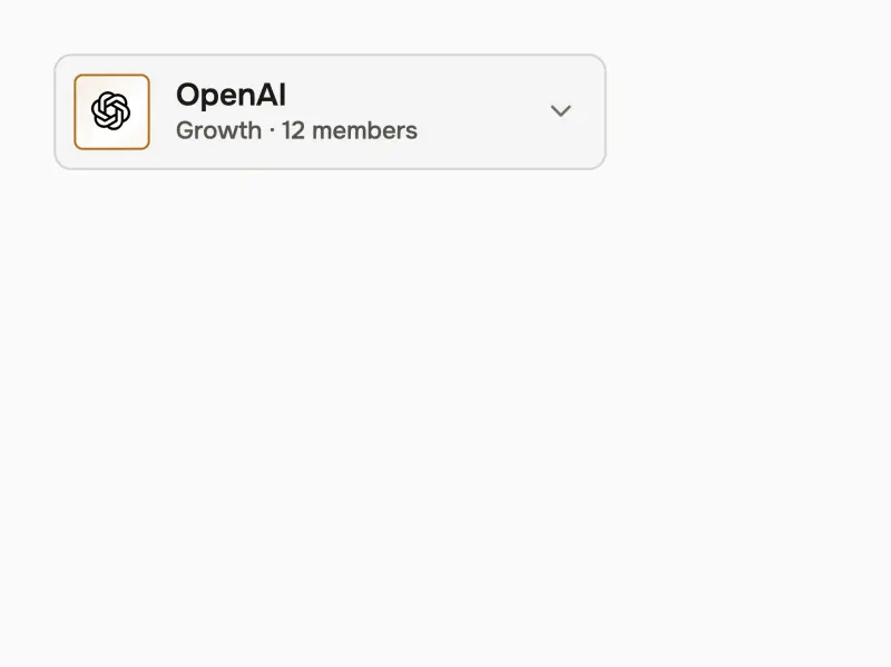
Workspace Switcher
VanillaReact
A Stripe-styled workspace switcher: a gradient logo-tile trigger opens a smooth-height reveal panel with the current-workspace header, a real-photo member facepile, a radio list that live-switches the trigger, a signed-in account row, plus create, settings and sign-out actions and keyboard.
#dropdown-menu
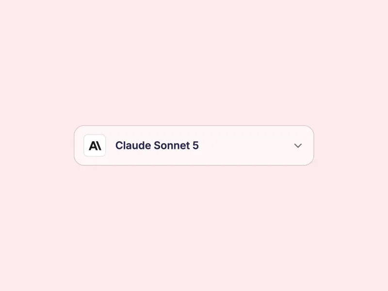
Searchable Dropdown
VanillaReact
A Grepline searchable dropdown — a command-style mono search input filters models as you type, every match run underlined in the accent with a live result counter, plus skeleton loading rows, arrow-key navigation, Enter to select and Escape to close.
#dropdown-menu#search#combobox
Ready to build?
300+ production-ready components and Atheros AI models. Every paid plan includes access to the whole Atheros — AI Builder and Learning.
Starting at $9.9 per month, billed annually