Accordion — Solid
accordion#faq#disclosure#data-display
Preview
1280 px
AI Assistant

Grab the code for this component with a free account
Every free component’s full source, ready to copy or download, plus 30 monthly AI credits for Atheros AI routing to make it yours.
Code
Grab the code for this component with free account
Every free component's full source, ready to copy or download, plus 30 monthly AI credits for Atheros AI routing to make it yours.
Accordion component
About Accordion — Solid
Solid letterpress accordion — accent-filled header blocks when open, a warm paper surface, hard borders with offset press shadows, folio numerals, grid-row height animation, chevron rotation, and full keyboard navigation, fully token-driven in a bold editorial identity.
Features
- APG disclosure pattern: each
<button>is the sole child of an<h2>, witharia-expanded,aria-controls, and a labelled panel hidden from assistive technology when collapsed - Two expand modes via
data-mode:singlecloses siblings,multitoggles independently - Layout-safe height animation using the CSS
grid-template-rows0fr to 1fr trick - Editorial letterpress identity: solid plum-filled header block when open, 2px ink borders, offset press shadows, ruled-paper backdrop
- CSS-counter folio numerals (
01,02, ...) stamped on every header — pure CSS, no markup changes - Chevron icon rotates 180 degrees on expand with a content fade and slide
- Keyboard navigation: Up/Down between headers, Home/End to jump, Enter/Space to toggle
- Responsive layout down to 320px with prefers-reduced-motion support
Accessibility
- Disclosure pattern
- Each header
<button>is the sole child of an<h2>and controls a labelledrole="region"panel - Collapsed panels
aria-hiddenandinertapply immediately;hiddenapplies after the closing transition and is cancelled on reopen- Keyboard nav
ArrowUp/ArrowDownmove focus,Home/Endjump,Enter/Spacetoggle- Focus indicators
:focus-visiblewith--ringoutline on all elements- Reduced motion
prefers-reduced-motion: reducedisables all animations- Viewport
100dvhfor mobile-safe viewport height
Customise it with AI
Open Accordion — Solid in Atheros AI Builder, pick a design system and ask the AI assistant to change the layout, copy or behaviour — the accordion is regenerated against your tokens. Take the HTML, CSS, JS and React source with you, or pull it into your repo from Claude Code, Cursor or Codex over MCP.
Explore Other Components
View all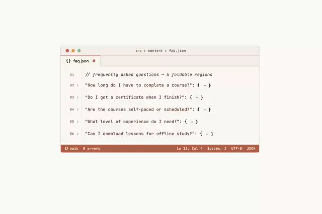
Accordion — Single Mode
VanillaReact
Single-mode ARIA accordion styled as a code editor — a faq.json tab with line-number gutter, code-fold carets, JSON syntax highlighting, and a VS Code style status bar. Opening one folded region closes the others, with grid-row height animation and full keyboard navigation, fully token-driven.
#accordion#faq#disclosure
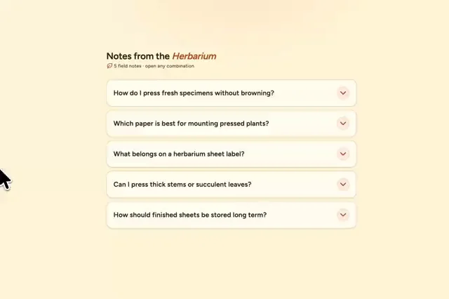
Accordion — Multi Mode
ReactVanilla
Multi-mode ARIA accordion on paper-like cards with accent-marked headings, Nunito Sans questions, and compact chevron controls — with grid-row height animation and full keyboard navigation. Panels toggle independently.
#accordion#faq#disclosure
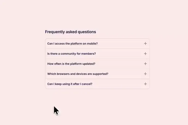
Accordion — Divider List
ReactVanilla
Divider-list FAQ accordion with animated plus/minus icons, single-mode expansion, grid-row height animation, and full keyboard navigation, fully token-driven and design-system agnostic.
#accordion#faq#disclosure
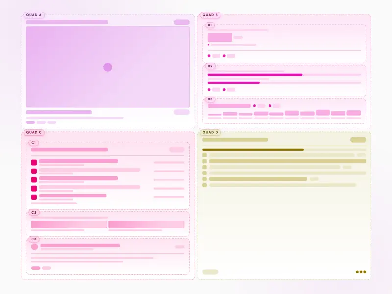
Asymmetric Quad
ReactVanilla
An asymmetric quad layout — four differently sized panels: an oversized hero, a nested stat/goals/spark trio, an avatar feed with captioned media, and a checkbox task panel. Skeleton wireframes driven by design tokens, reflowing from a 2×2 grid to a single column, mobile-first.
#layout#grid#bento
Profile Dropdown Menu
ReactVanilla
A profile dropdown led by an identity header for the signed-in account, with quick actions and soft key-chip shortcut hints, a What's new discovery item, a switch-account list of the other accounts with a hover switch arrow, a dark mode toggle row grouped above the error-weighted sign-out action — fully token-driven and design-system agnostic.
#account-switcher#dark-mode#responsive
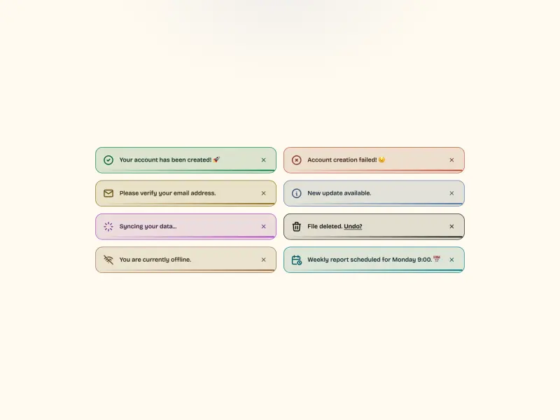
Outlined Toasts
VanillaReact
A grid of eight outlined toast notifications — each a light-tinted card with a 1.5px coloured outline, a 24px line icon, a short message, and a smoothly filling progress bar. One toast spins a loader; one carries an inline link. Fully token-driven and design-system agnostic.
#toast#notification
Ready to build?
300+ production-ready components and Atheros AI models. Every paid plan includes access to the whole Atheros — AI Builder and Learning.
Starting at $9.9 per month, billed annually